5 B2B Landing Page Examples and What Makes Them Effective

A good B2B landing page makes a complex product easier to understand and gives the right people a clear next step. These five B2B landing page examples use different approaches to do that, from Warp’s detailed product visuals to Ramp’s customer proof. We’ll look at the design choices we like and what you can take from them for your own page.
What These B2B Homepages Do Well
The pages below are homepages, so they have navigation and several paths into the product. A campaign landing page might need a narrower focus, but the same questions still apply: Can visitors understand what you offer? Can they picture it solving a problem? And is the next step clear?
The best examples also have a point of view. They make space for personality while helping a business buyer understand the product.
Warp: Product Screenshots With Depth and Motion
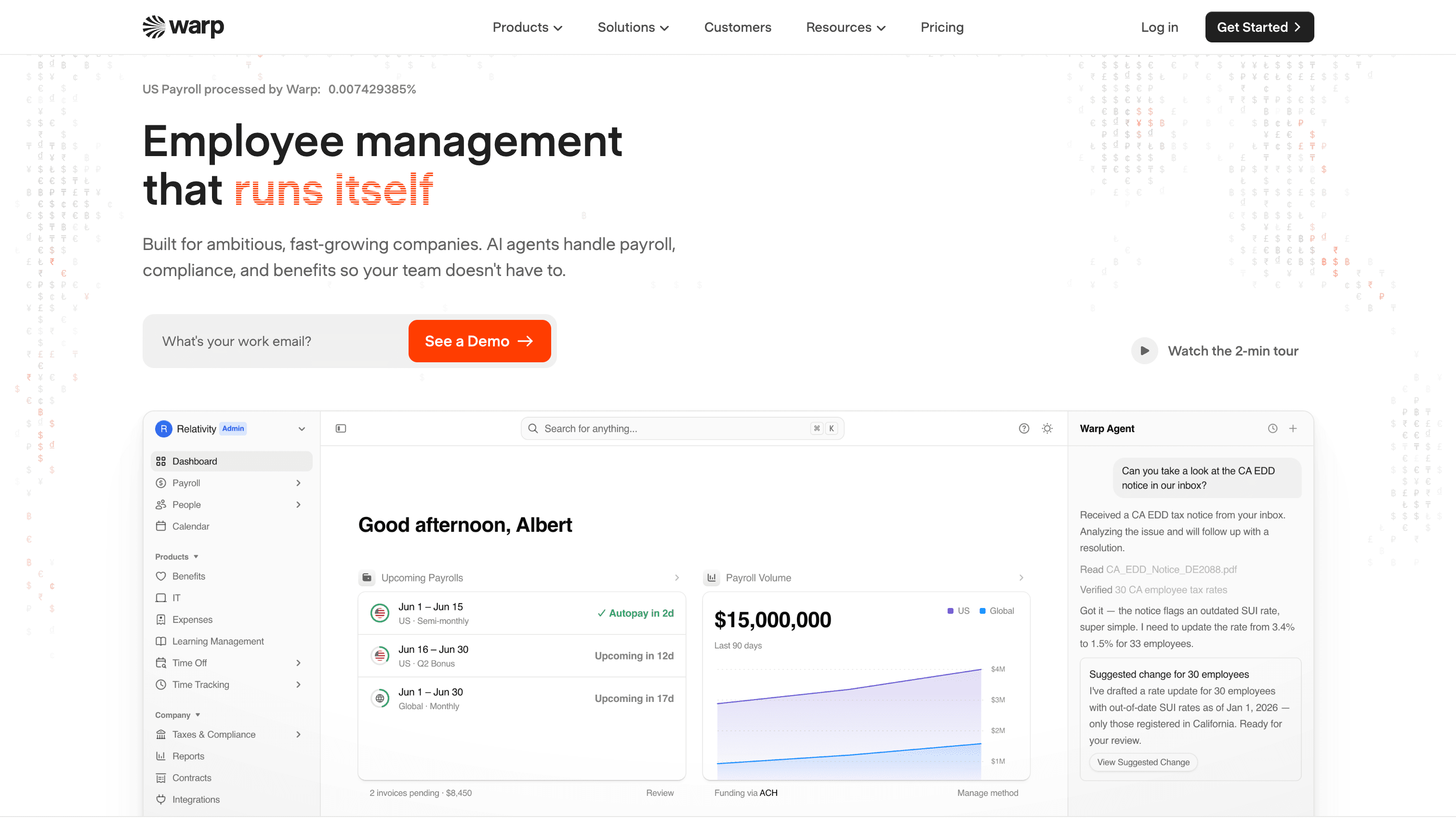
Warp makes payroll and employee management feel like a product worth exploring. The page uses sharp interface visuals and smooth animations to show the software, with enough whitespace around each section to let the details land.
Our favorite part is the feature imagery. The visuals have depth and movement, which makes them more engaging than a flat screenshot while keeping the interface recognizable. For a product that handles complicated administrative work, seeing those workflows helps make the offer more concrete.
Warp uses “See A Demo” on its payroll page. That invitation fits software a company may want to evaluate with its own payroll and compliance needs in mind.
Why we like this page
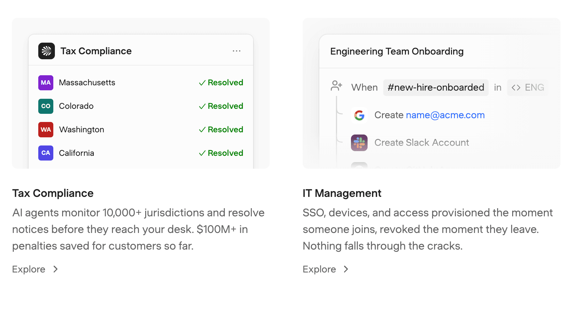
- The product visuals are crisp enough to show useful detail.
- Motion adds energy to the feature sections without crowding the surrounding copy.
- Whitespace gives each message room to breathe.
Stacks: Making Accounting Software Feel Approachable
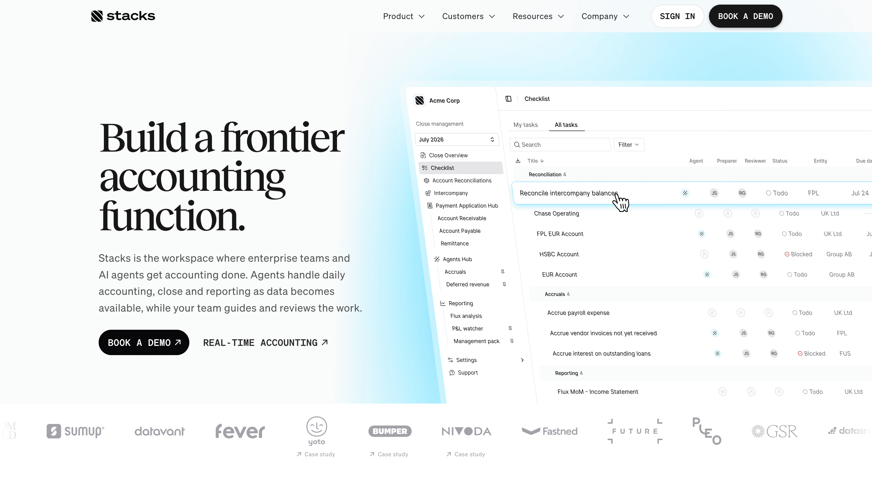
Making accounting software look interesting is an achievement on its own. Stacks does it with a light background, generous spacing, and a large product preview that gives the page a polished feel.
The page introduces Stacks as a workspace where enterprise teams and AI agents handle accounting together. Showing the interface alongside that explanation gives visitors a better sense of what the work looks like. A complex category starts to feel more approachable when the product is right there to explore.
Why we like this page
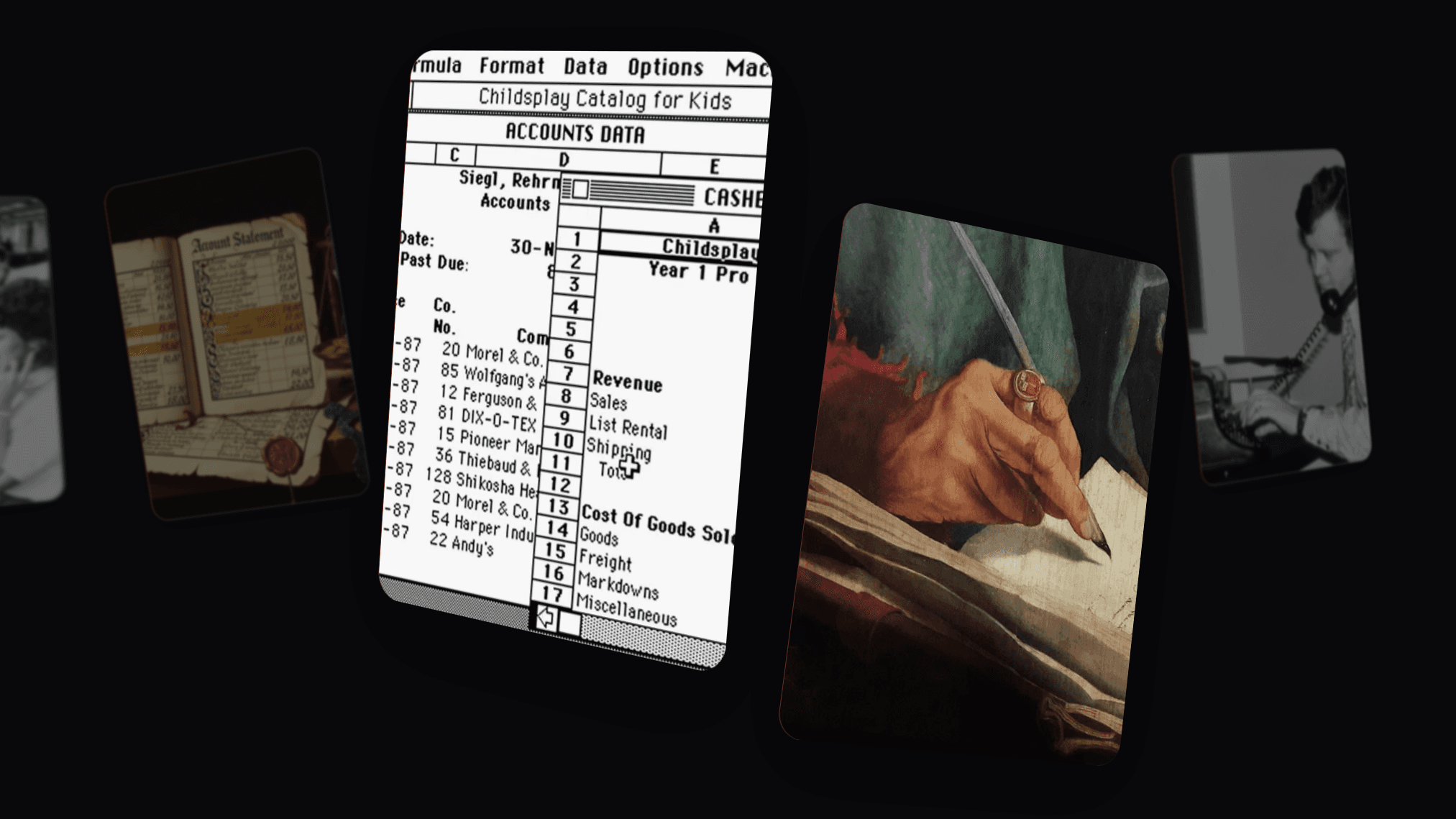
- The product preview gives a technical subject a clear visual anchor.
- The layout separates the main message from supporting details.
Jasper: A B2B Page With Personality
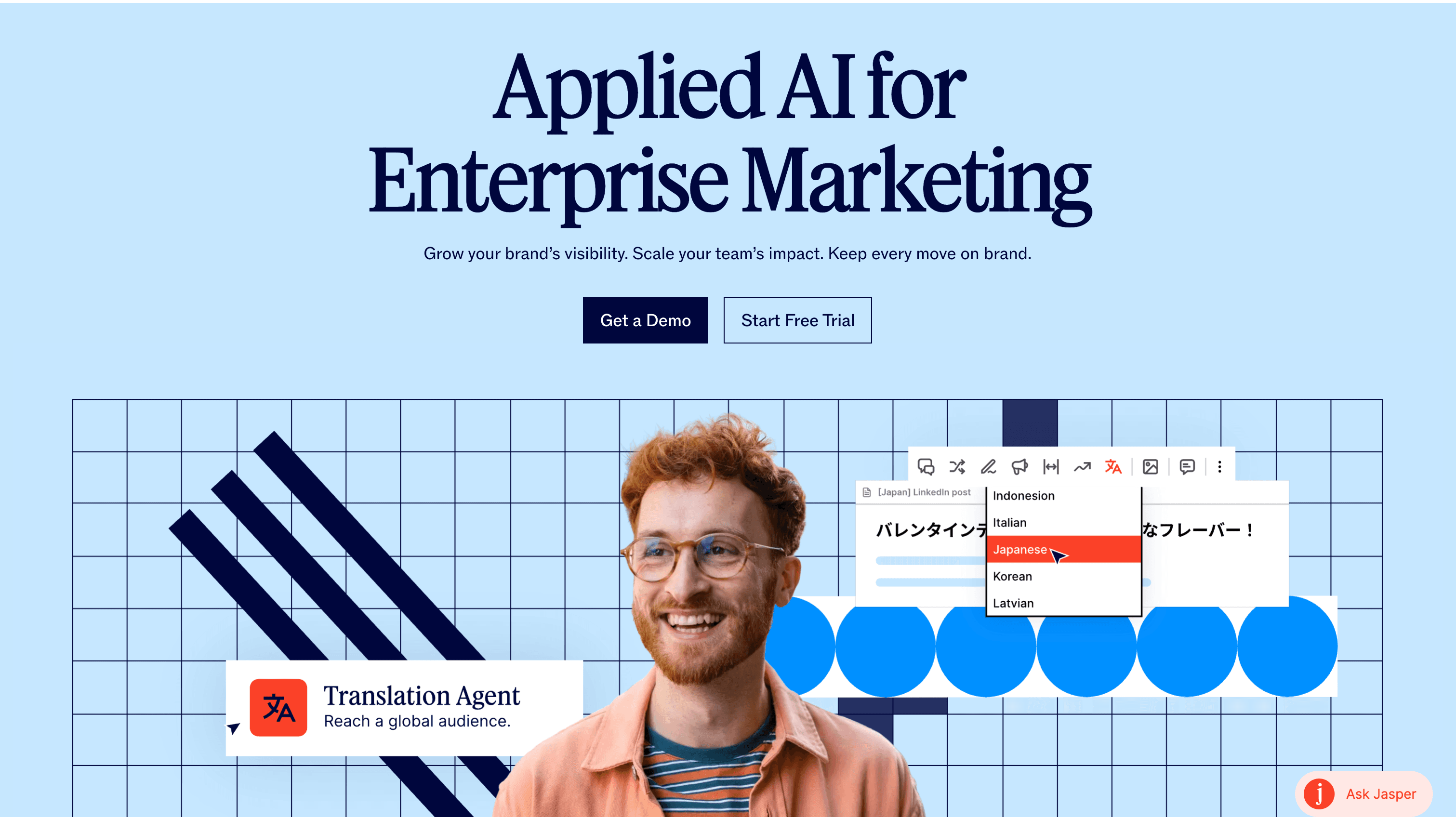
Jasper shows that a B2B page can be colorful and distinctive. Its visual identity uses vibrant colors, branded graphics, photography, and animated assets to give a marketing product a creative feel.
We like how the page combines real photos with graphic elements. The imagery feels considered and specific to the brand, rather than like a collection of unrelated assets. That consistency matters when a page moves between different features and messages.
Jasper offers both “Free Trial” and “Get a Demo.” Someone who wants to explore can choose the trial, while a team looking for a conversation has a separate route. Two CTAs can work when they reflect different visitor needs.
Why we like this page
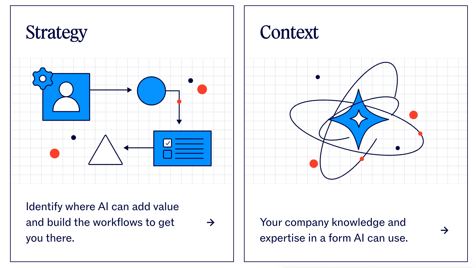
- Branded illustrations and graphic treatments give the page a recognizable identity.
- Photography adds a human element to the software story.
Ramp: Social Proof Woven Into the Story
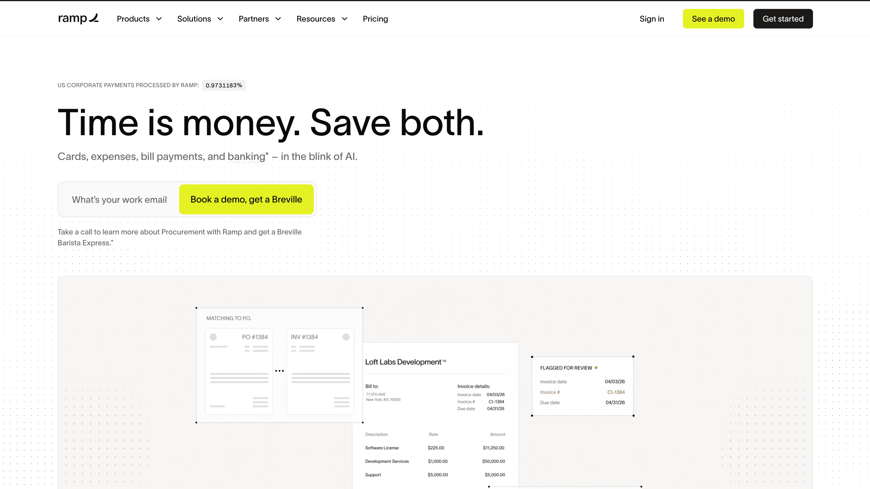
Ramp has a lot to explain. Its platform covers cards, expenses, bill payments, and other finance workflows. The page makes that breadth easier to navigate with large typography, generous spacing, and a clear visual hierarchy.
What stands out to us is the way customer proof appears throughout the page. Instead of leaving every testimonial for one section at the bottom, Ramp places customer stories and quotes alongside the product narrative. Readers can see who uses the platform as they learn what it does.
The hero pairs a work-email field with “Get started for free.” It’s a direct invitation for visitors ready to take the next step, while “View Demo” appears elsewhere for people who want to see more first.
Why we like this page
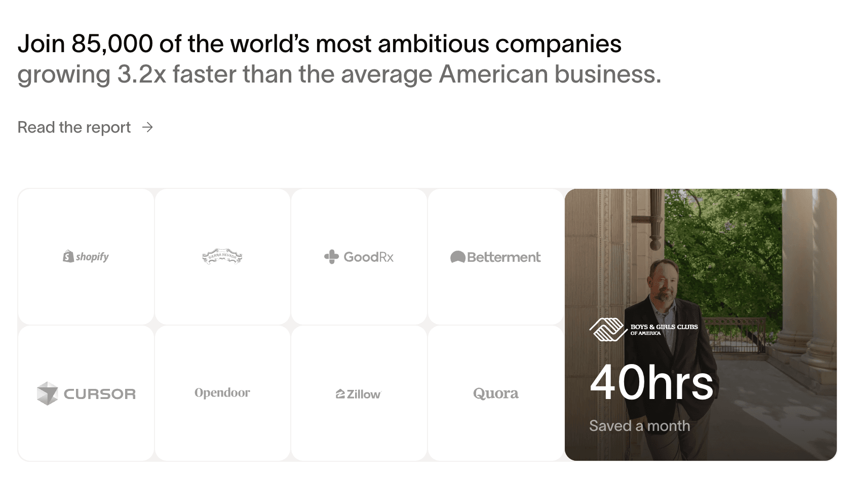
- Customer proof appears in different formats throughout the page.
- Large headlines make a broad product easier to scan.
- Bright CTA buttons stand out against a restrained layout.
DoorLoop: A Clean Page With a Recognizable Identity
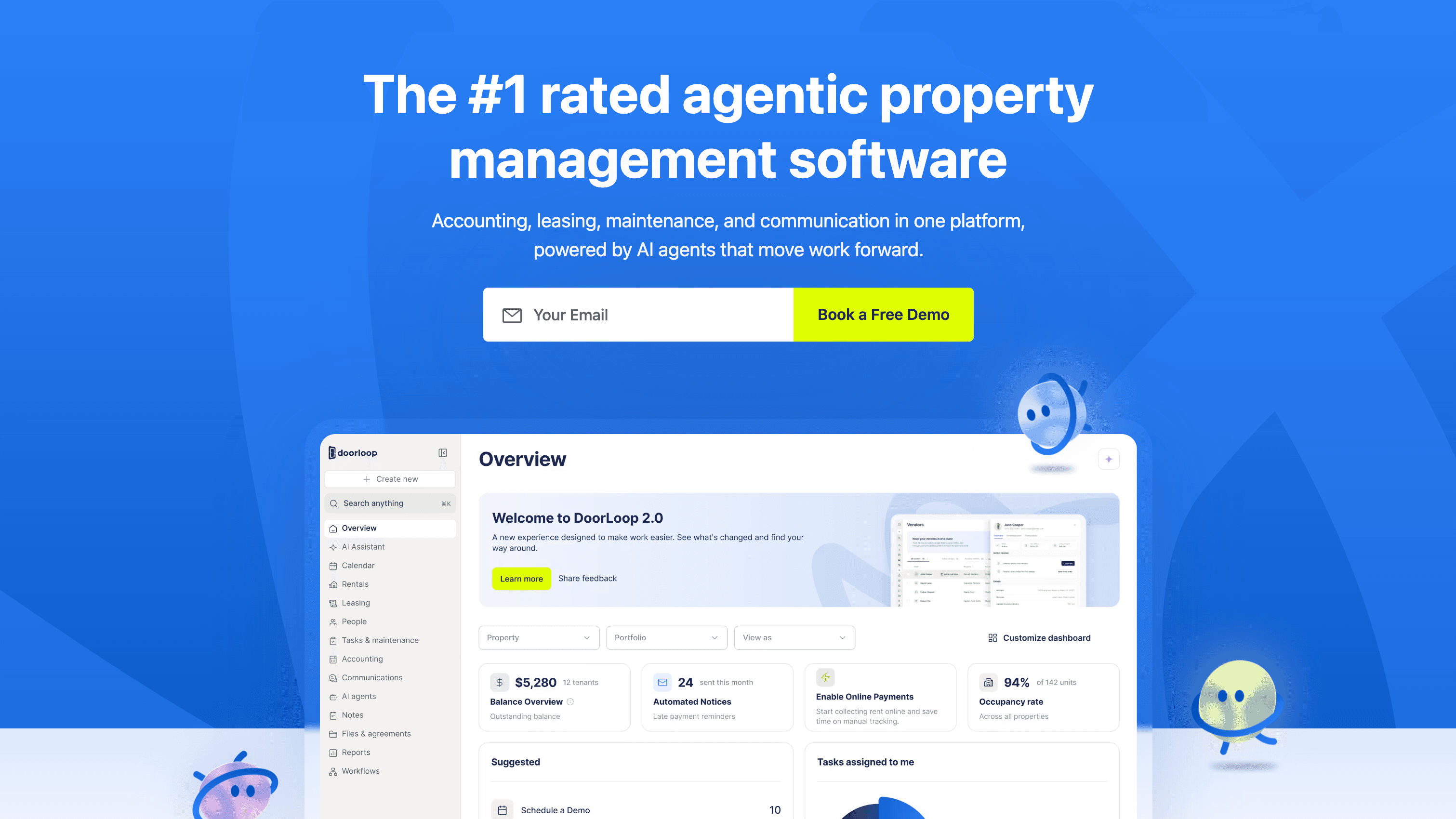
DoorLoop brings accounting, leasing, maintenance, and communication together for property managers. That’s a lot of ground to cover, but the page gives each part of the product space.
The imagery is sharp, the corners are rounded, and the accent colors add personality without making the layout feel busy. We also like the recurring loop shape used across the visual assets. It’s a small brand detail that helps different sections feel connected.
DoorLoop introduces the product through familiar property-management tasks, from collecting rent to handling maintenance. That language helps visitors connect the platform to work they already do.
Why we like this page
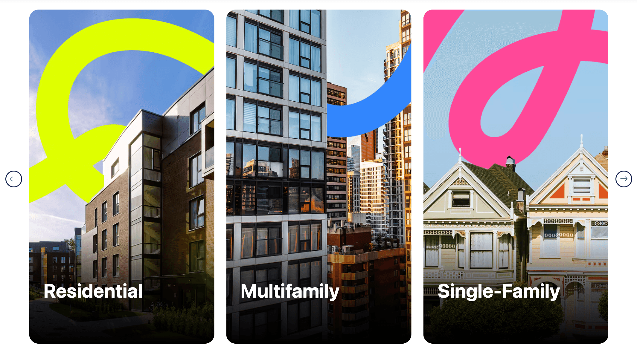
- Product imagery has depth while remaining easy to read.
- Accent colors add energy to an otherwise clean composition.
- The recurring loop motif gives the page a visual thread.
How We Picked These B2B Landing Page Examples
We looked for pages with a distinct point of view that still communicate the product’s value. In particular, we considered:
- Color: Does the palette work together and draw attention to important elements?
- Typography: Can readers tell what to read first, and is the supporting copy easy to follow?
- Uniqueness: Is there something memorable about the page after you close the tab?
- Imagery: Do the visuals explain the product or give the brand personality?
- Hierarchy: Can the intended audience understand the offer and find a useful next step?
These choices work best together. A distinctive illustration can attract attention, but it still needs a headline and layout that help visitors understand what they’re looking at.
Final Thoughts
Start with the problem on your own page. If visitors struggle to picture your product, look at Warp’s feature imagery or Stacks’ interface preview. If the page feels generic, Jasper’s branded graphics or DoorLoop’s recurring motif might offer a useful direction.
Make one change, then ask someone unfamiliar with the product what it does and where they’d click next. Their answer will tell you more than another hour adjusting the button color.