Utilities, not a second stylesheet
Each component is React plus Tailwind classes. You edit spacing, type, and color in the same file you already ship.
Create interfaces with Tailwind CSS components
Ready-made interface pieces that work perfectly with your existing Tailwind setup.





A signature, cards, trust marks, and a file upload. Each one opens its own page with the source, prompt, and install command.
A name that signs itself when it appears. The pen lifts once the ink is down.
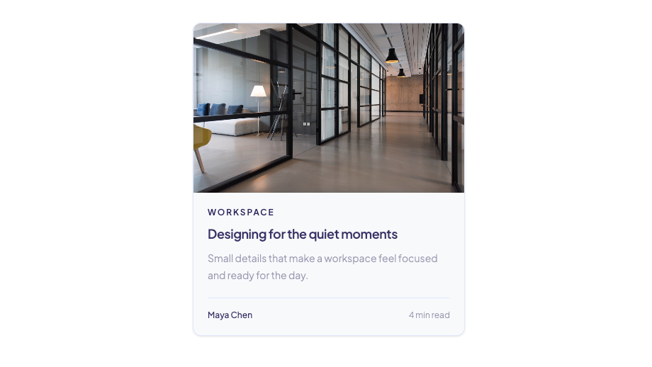
Editorial card with a full-bleed image, story metadata, and optional link wrapper.
Editorial rating with sequentially drawn stars, review count, and a soft luminous edge.




Joined by 2.4k builders
Layered portraits with grayscale-to-color hover, spring lift, and a glass +N counter.
Translucent offer marker with a low-frequency glow pulse and optional dismiss.
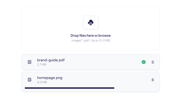
Polished file upload component with drag and drop, validation, progress, errors, and removable file rows.
Open a component and check the preview.
Use the MCP, paste the AI prompt, run the registry command, or copy the files in yourself.
Classes and semantic tokens sit in the component. Recolor it by changing your theme, not a separate skin file.
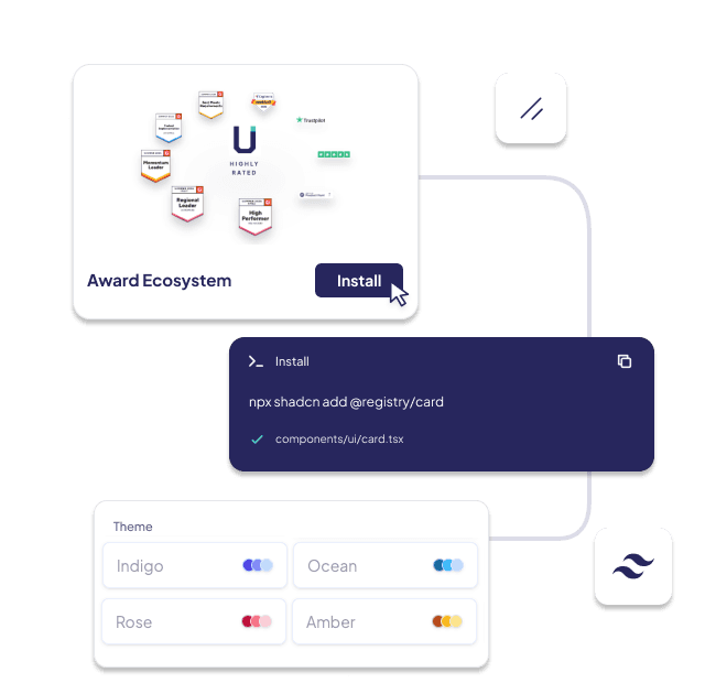
Each component is React plus Tailwind classes. You edit spacing, type, and color in the same file you already ship.
Semantic tokens such as background, foreground, and primary follow the Tailwind theme already in the project.
Install a card, a badge, or an upload field. You do not have to adopt a full kit before the first screen looks finished.
The registry copies the component into your repo. After that it is your code, with the same props shown in the catalog.
Backgrounds, navigation, forms, and more live in the catalog. This page is only a starting set.