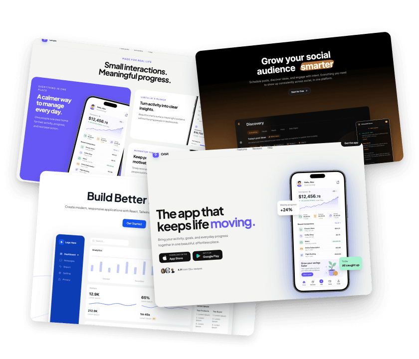
Browse components
Components
Reusable UI building blocks for Uniquel landing pages.
Subtle React animations for text, headlines, and interactive interfaces.
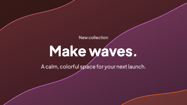
Hero backgrounds, gradients, and surface patterns for section shells.
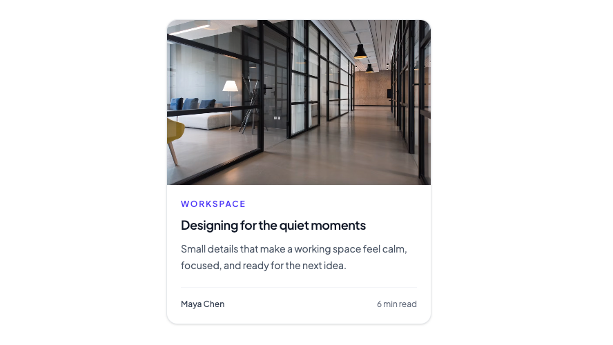
Flexible content, product, and dashboard card layouts for common interface patterns.
Editorial accents for long-form and marketing pages.
Compact CTAs and offer markers designed to earn the click.
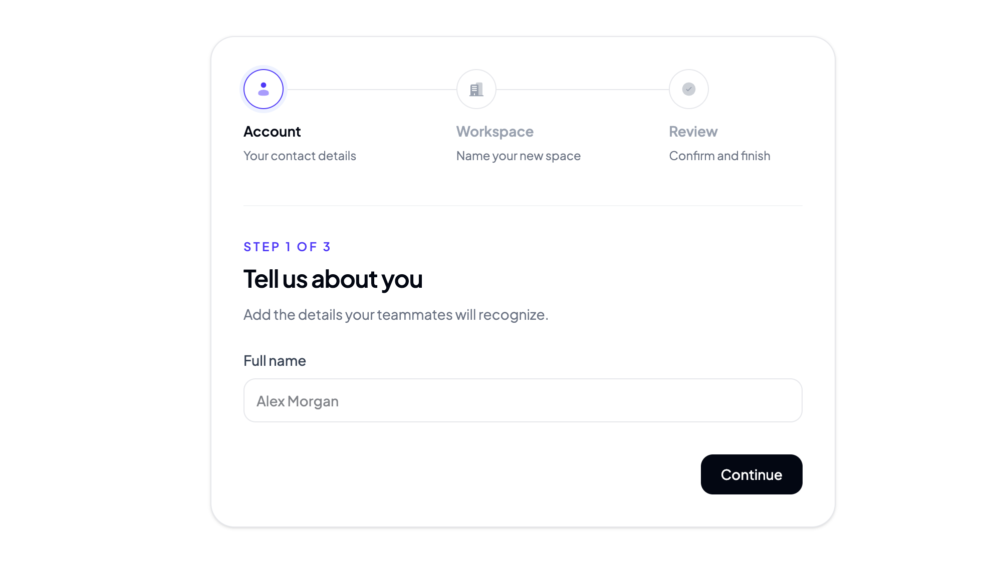
React form components for clear inputs, validation, and multi-step flows.
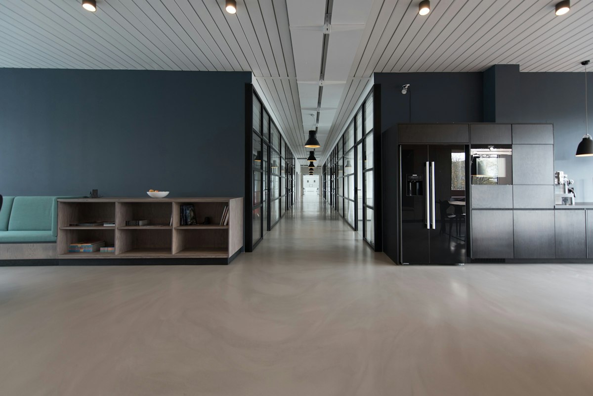




Image galleries and preview cards for showcasing product visuals and templates.
Interactive input components for quantities, settings, and structured values.










Hub diagrams and connection visuals for product ecosystems and partner graphs.
New: Coverflow Gallery is live — explore the catalog. See what's new
Lightweight wayfinding and locale controls for landing pages.
Overlay loaders for React and Tailwind CSS — full-screen and embedded loading states for pages, panels, and dialogs.
Realistic device frames with replaceable screenshots for showcasing your mobile app product.
Feature and integration tokens for product storytelling.
React splitter components for resizable dashboards, editors, and workspace layouts.




Joined by 2.4k builders
Social proof elements — avatars, ratings, and quiet credibility signals.
Need a full landing page?
Skip assembling pieces — start from a polished template built for your AI tool.