12 Call to Action Examples for SaaS Landing Pages

A useful call to action tells visitors what happens next and makes that step feel reasonable. The button matters, but so do the headline, proof, placement, and amount of commitment around it. These 12 call to action examples show how SaaS companies and other digital businesses handle that full package, from hero trials to footer account links.
What Makes a CTA Work?
Strong CTA copy usually starts with a verb and names a concrete next step. Nielsen Norman Group recommends labels that are clear enough to stand alone and warns against vague commands such as “Continue” or “Next” in its guidance on button labels and states.
Match the label to the commitment. A free creative tool can offer an immediate trial. Enterprise software may need a demo or product tour. A product still in development should ask only for an email.
12 Real CTA Examples and Why They Work
Each example below pairs the button copy with the section around it. That context explains why similar labels can feel clear on one page and vague on another.
Maybe: Start Your Free Trial
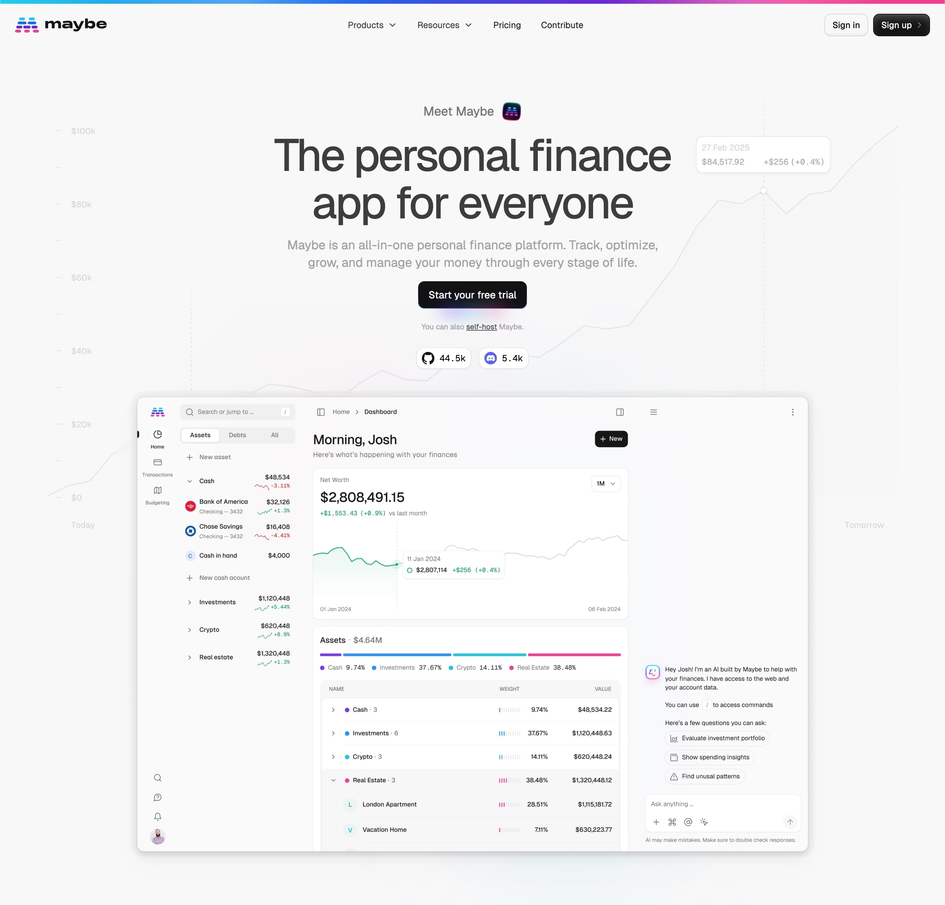
Maybe puts “Start your free trial” below a plain product description. The button names the action and lack of upfront cost. A self-hosting link and visible community counts offer other ways to judge the product without competing visually with the trial.
Lattice: Request a Demo or Take a Product Tour
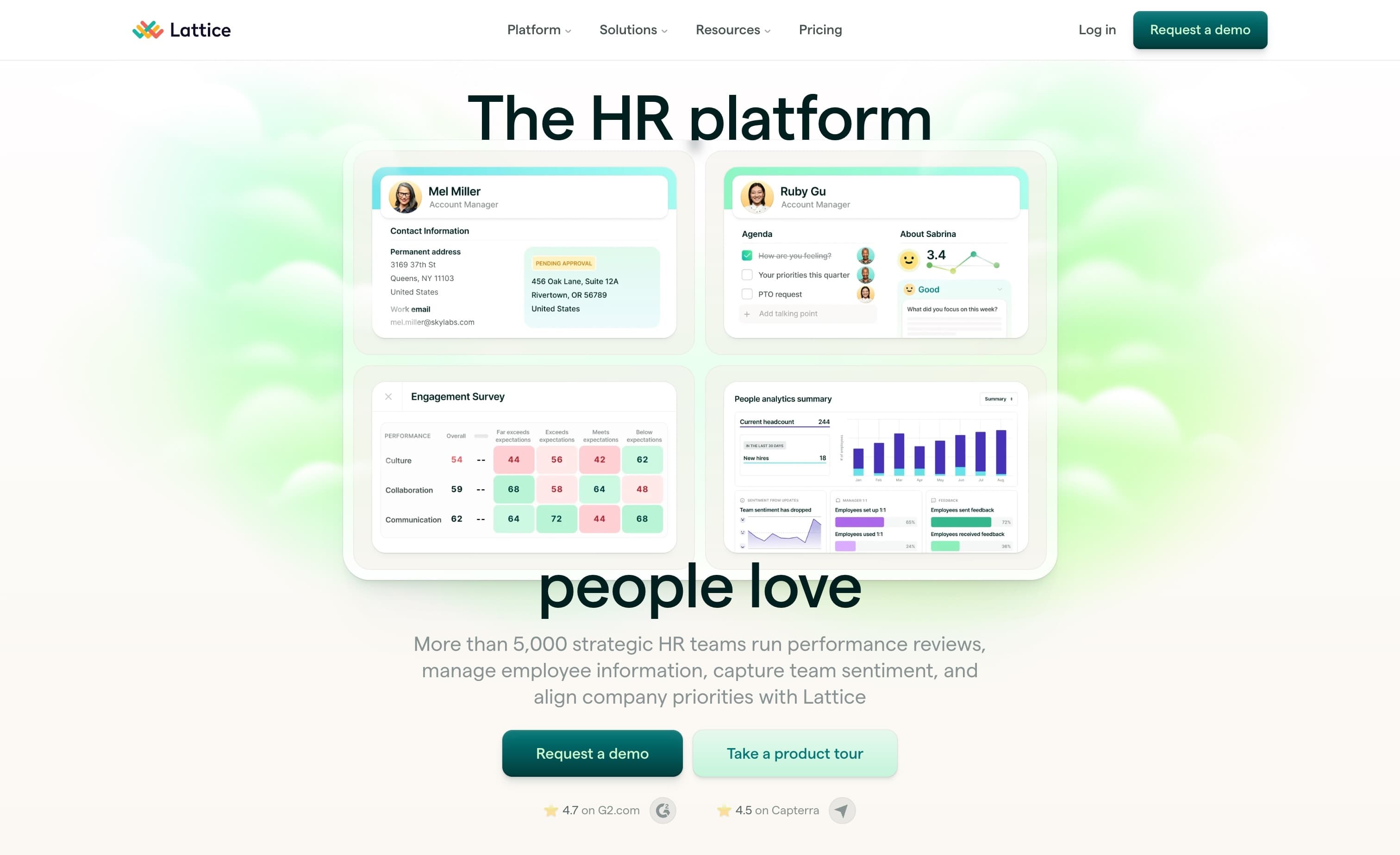
Lattice serves two levels of buying intent. “Request a demo” fits visitors ready to speak with sales, while “Take a product tour” gives researchers a lower-pressure path. The demo remains primary, and review scores reduce the risk of an enterprise purchase.
Jitter: Try Jitter for Free
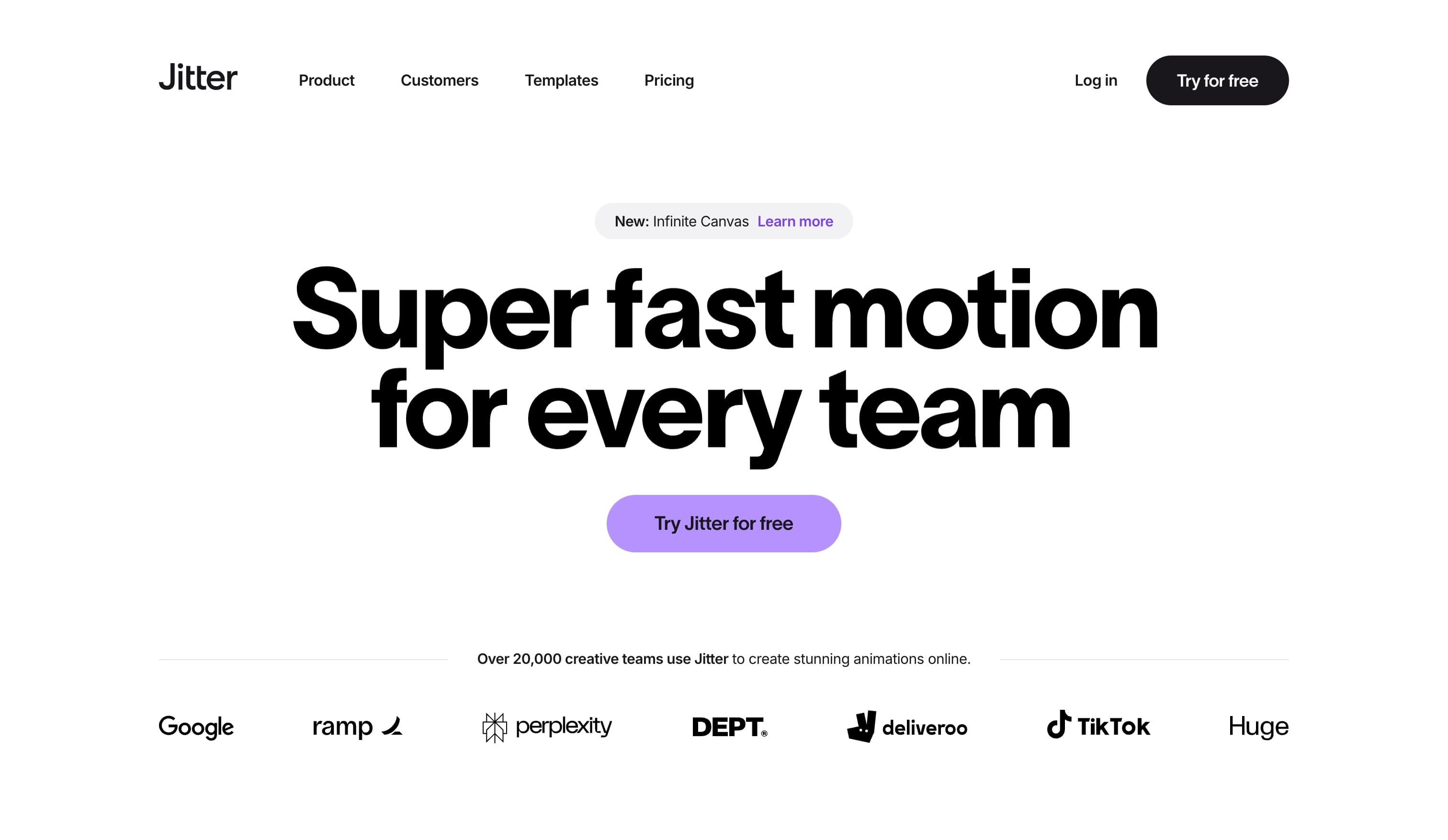
“Try Jitter for free” is direct and appropriate for a product people can evaluate by using it. Customer logos sit just below the hero, helping an unfamiliar visitor see that established creative teams already use the tool.
Ruul: Open an Account
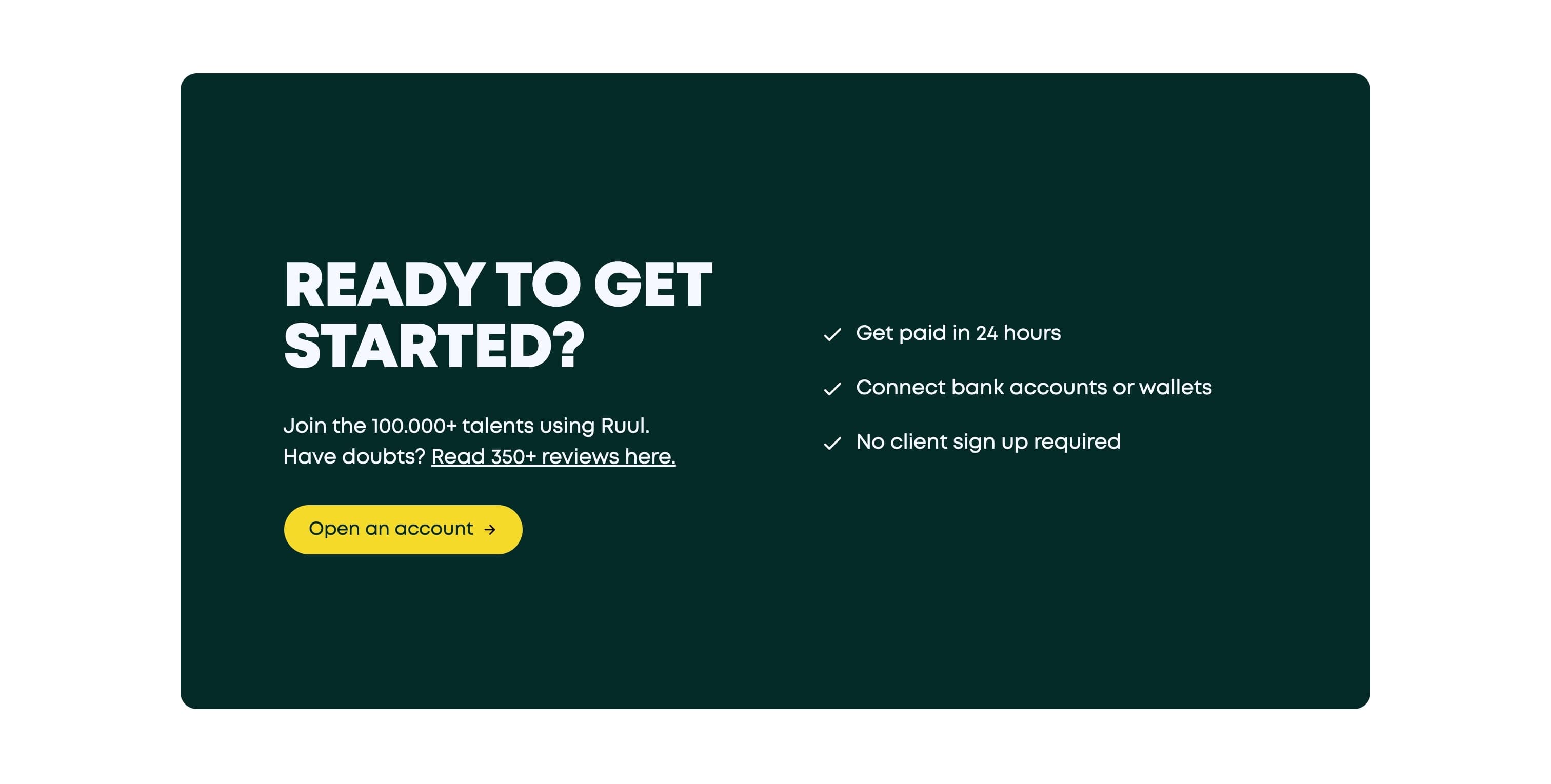
Ruul places “Open an account” next to concrete benefits: fast payment, wallet support, and no required client signup. The label is more specific than “Get started,” and the bright yellow button is easy to find against the dark panel. Review volume adds reassurance close to the decision.
Ada: Get a Demo
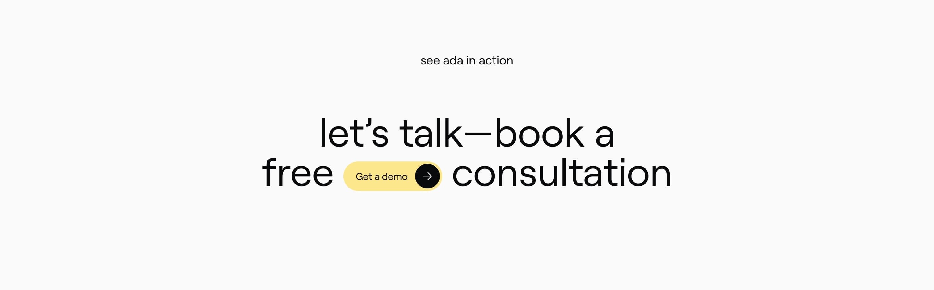
Ada inserts “Get a demo” into the sentence “let’s talk, book a free consultation.” That treatment makes the button part of the message instead of a separate command below it. The surrounding copy also explains the result of clicking, which matters because requesting a demo usually leads to a form or sales conversation.
n8n: Start Building
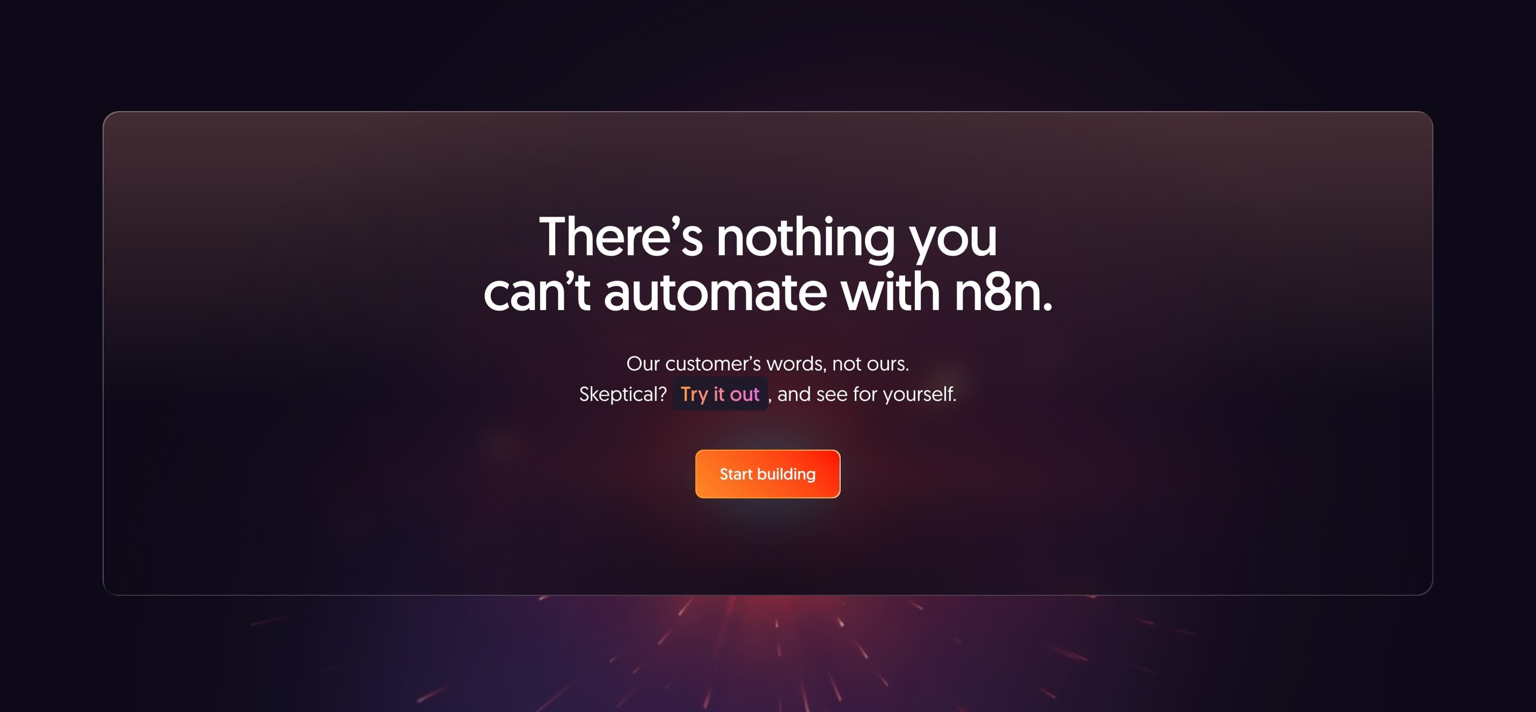
n8n’s “Start building” connects the click to the product’s core activity. It feels more concrete than a generic signup label and follows a confident claim about what users can automate. The isolated banner gives the CTA room to breathe after visitors have encountered product details elsewhere on the page.
Designup: Get Started Now
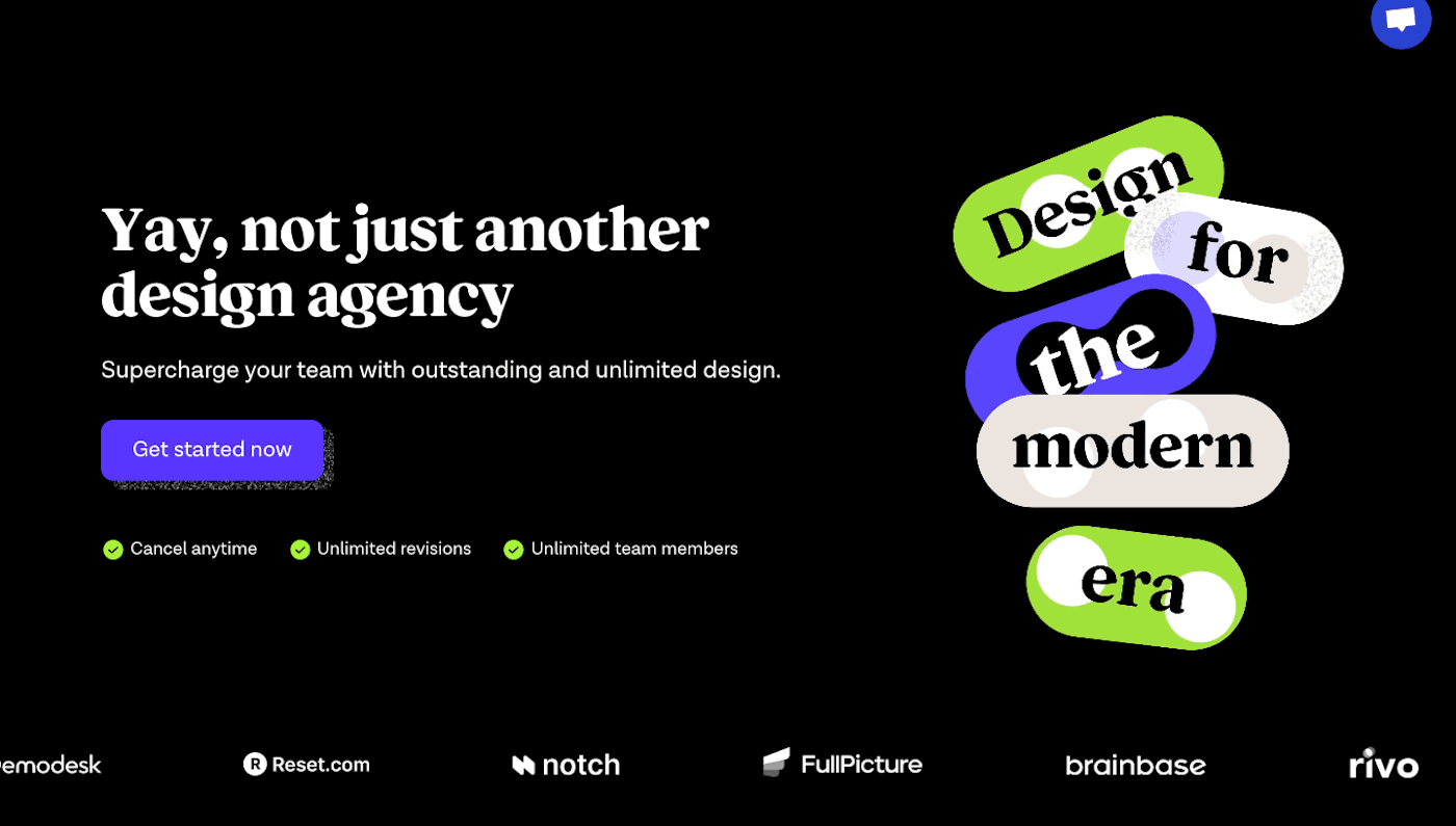
“Get started now” is broad, but Designup supports it with details about cancellation, revisions, and team members. Those points answer practical questions before the click. Client logos also lend credibility to an agency the visitor may not know.
SavvyCal: Sign Up With Google

SavvyCal’s compact banner pairs “Start sharing links now” with “Sign up with Google.” The button explains the signup method, which makes the next step predictable and implies a short path into the product. This is a good pattern when the authentication provider genuinely removes setup work.
Shelf: Join Waitlist
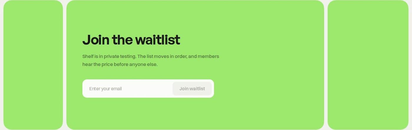
Shelf cannot offer immediate product access, so it asks for the smallest useful commitment: an email address. The copy explains that the product is in private testing and that the list moves in order. “Join waitlist” accurately describes the outcome instead of pretending that the visitor can start using the product today.
Noho: Make an Order
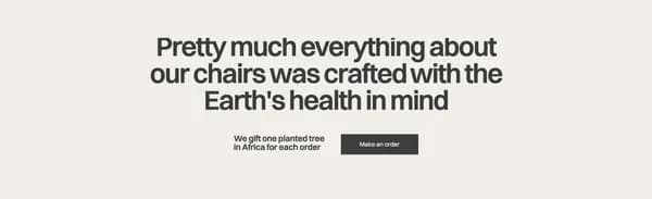
Noho connects “Make an order” to its sustainability message and a specific pledge to plant a tree for each order. The CTA appears above the FAQs, where a visitor has likely seen the products but may still have questions. The placement offers a purchase route without removing access to those final details.
pliability: Get Started or Explore Teams
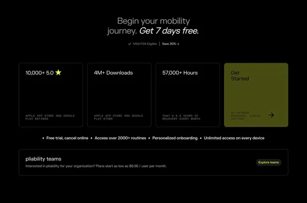
pliability combines product metrics, a seven-day free trial, and “Get Started” in one panel. A separate “Explore teams” action sits below for organizational buyers. The labels are short, but the layout provides enough context to distinguish an individual trial from a team plan.
Epidemic Sound: Create Free Account
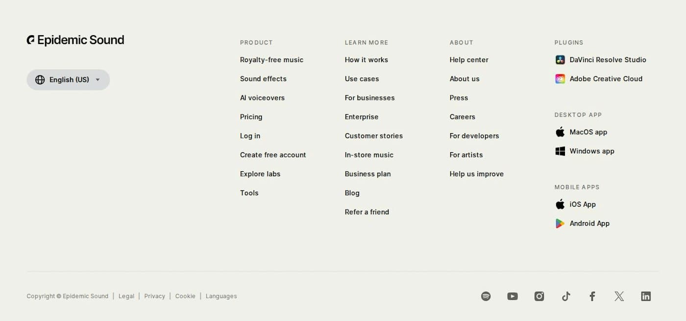
Epidemic Sound includes “Create free account” in its product links. Visitors who reach the bottom still have a conversion path alongside pricing, login, and product information. The word “free” removes uncertainty about the immediate cost.
What to Borrow From These CTA Examples
Start with the step you can honestly offer. “Start building” works when people can enter the product quickly. “Request a demo” sets the right expectation for a sales-led process. “Join waitlist” is clearer when access is unavailable.
Then check the surrounding section. Add proof when the decision carries risk, explain what happens after the click, and give secondary actions less visual weight. Multiple prominent actions can compete with one another and make visitors hesitate.
For an initial version, use this checklist:
- Begin with a specific verb.
- Name the result when the label has room.
- Match the commitment to the visitor’s likely intent.
- Keep one visually dominant action per section.
- Verify the destination delivers what the label promised.
Final Thoughts
The best CTA is rarely the cleverest phrase on the page. It is the clearest reasonable next step. Choose the action first, write the label second, and review the whole section before debating button color. If a visitor can predict what happens after the click, the CTA is doing useful work.