7 SaaS Landing Page Examples and Why We Like Them

A SaaS landing page needs to explain the product and give visitors a reason to explore it. Good design helps with both, whether through useful product previews, distinctive imagery, or a layout that’s easy to follow. These seven SaaS landing page examples show different ways to approach that job, with practical notes on what works and how the design supports the next click.
What These SaaS Homepages Do Well
Most of these are SaaS homepages, with navigation and several routes into the product. A campaign landing page usually needs a narrower goal. Keep that distinction in mind when borrowing a layout or deciding how many actions to offer.
Plaid: Illustrations Give Finance a Personality
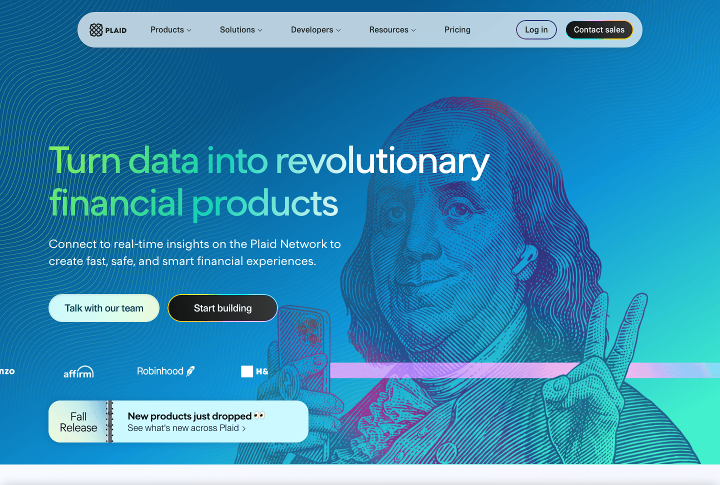
How do you make financial infrastructure interesting to look at? Plaid uses familiar faces from US dollar bills, including Benjamin Franklin, and gives them a playful illustrated treatment. It’s an unusually good fit for a service that’s difficult to show in a photograph.
Why we like this page
- The illustrations are specific to finance and recognizable enough to carry the hero.
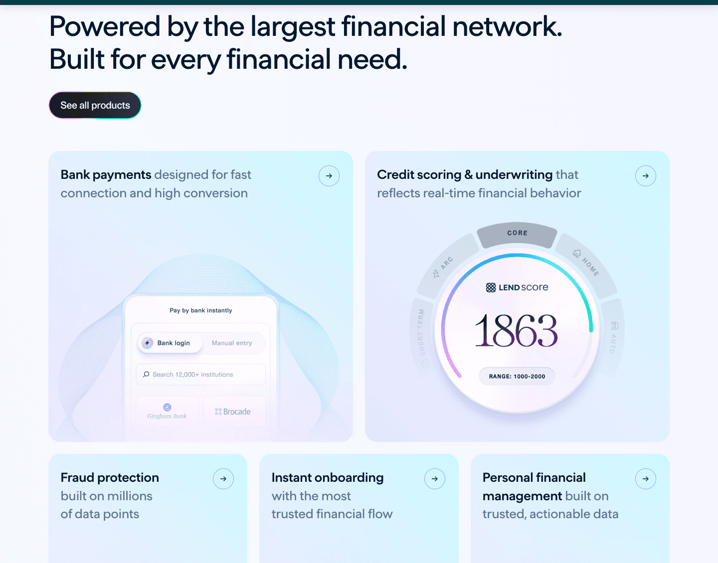
- Gradients, product assets, and spacing feel balanced across the page.
- “Talk with our team” and “Start building” give buyers and developers separate entry points.
Granola: Restrained Color and Natural Movement
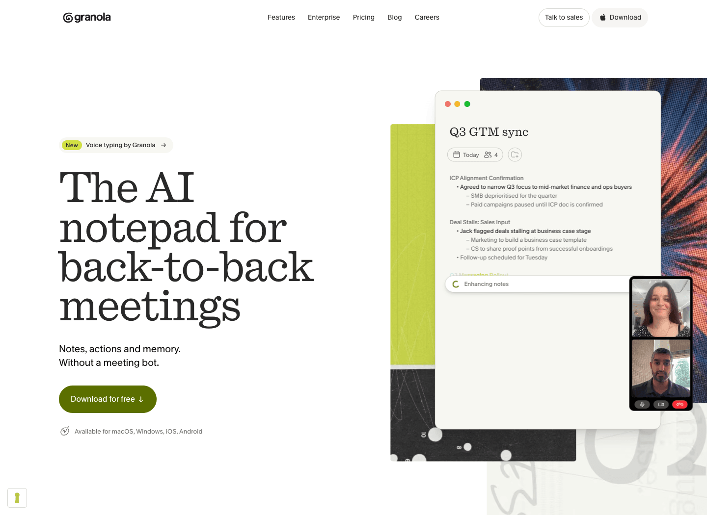
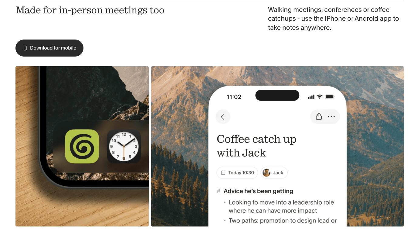
Granola gets a lot from a restrained palette. Accent green sits comfortably beside grayscale, while warmer background images stop the page from feeling cold. “Download for free” makes the next step easy to understand.
Why we like this page
- Green accents give important elements emphasis, while the warmer imagery keeps the palette welcoming.
- The scroll effects move smoothly through the hero and feature sections, with visitors still controlling the pace.
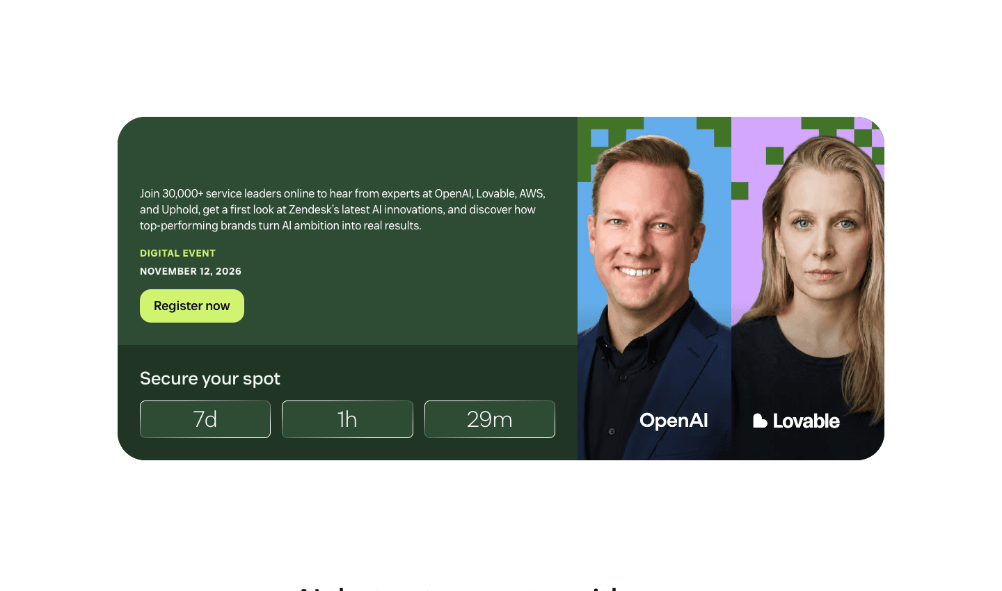
Zendesk: Photography With Product Context

Our favorite detail on Zendesk is the photography. High-quality pictures of people become part of the product story through interface screenshots and branded graphics.
The signup is practical, too. “Try for free” sits with the work-email field, a 14-day trial explanation, and “No credit card required.” Those details answer questions a button alone can’t.
Why we like this page
- The image treatments make the photography feel like it belongs to Zendesk.
- People and product details share the composition, so the software has a human context.
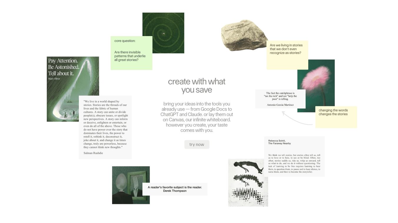
Sublime: One Memorable Visual, Plenty of Space
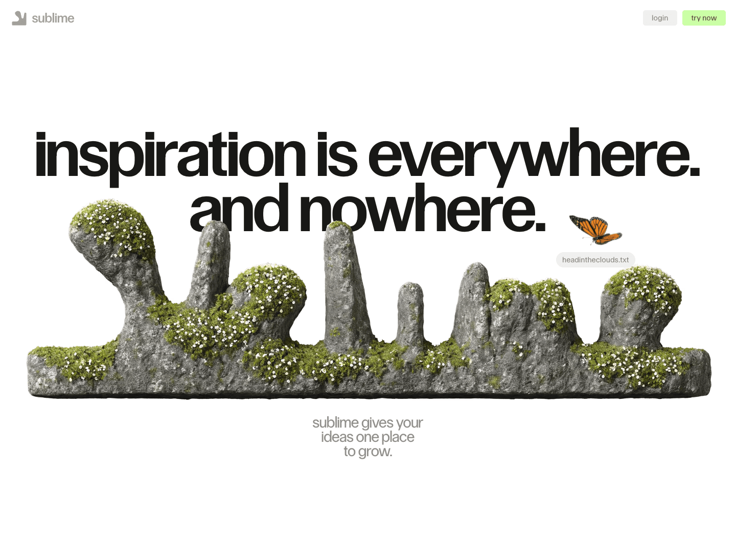
Sublime is our strongest recommendation for visual inspiration. The moss-covered stone sculpture shaped like its logo is the reason.
Sublime supports web and iOS, so this is useful inspiration for either kind of launch. A custom sculpture won’t suit every budget, but giving one strong asset enough space is a decision anyone can borrow.
Why we like this page
- Oversized typography and a white canvas give the sculpture room, with little introductory copy to compete with it.
- The modest “try now” invitation fits a tool for collecting and discovering ideas.
Tella: Let the Videos Do the Explaining
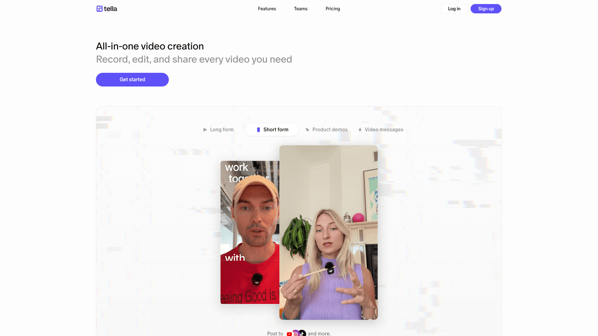
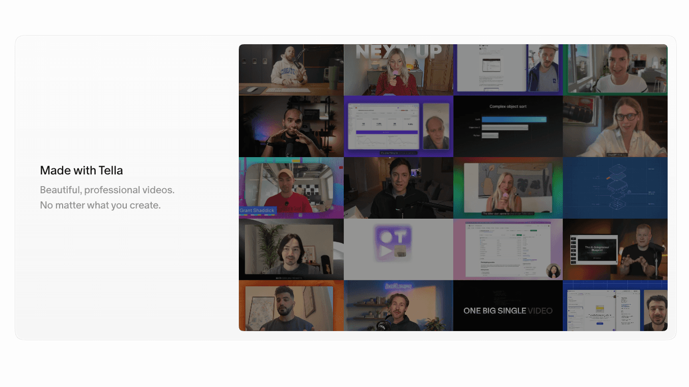
Tella feels clean. There’s room to take in a product demonstration before the page asks you to read something else, and the short copy helps. For a video creation tool, showing polished videos is a sensible use of that space.
“Get started” follows “Record, edit, and share every video you need.” The sentence gives the broad button label enough context.
Why we like this page
- The demonstrations show what the editor can produce before visitors need to read a feature explanation.
- Generous whitespace gives people time to watch, which matters when the video output is the reason to buy.
Creatify: Gradients With a Purpose
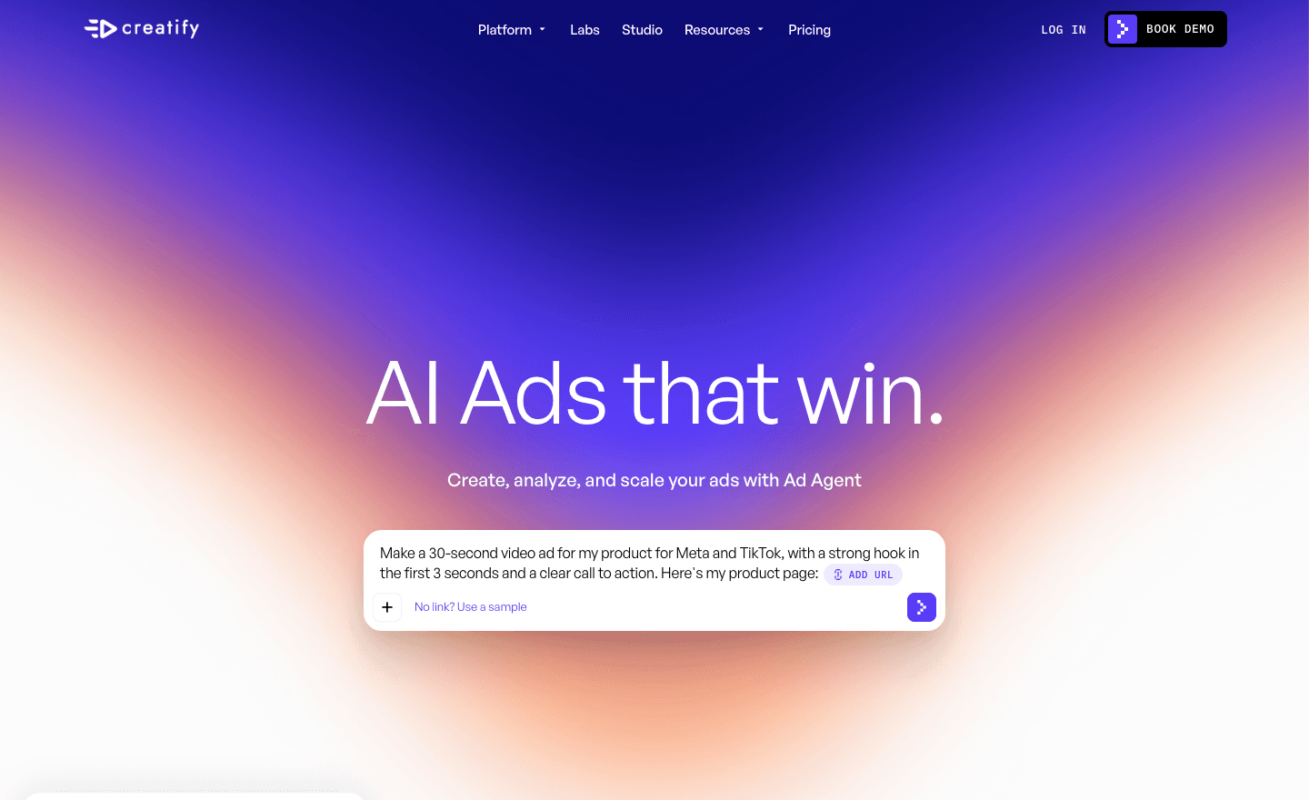
Gradients are easy to overdo. Creatify is a good reference when you want expressive color around an AI product without making the page feel generic. The gradient gives the hero its atmosphere while leaving the headline and product prompt readable.
“BOOK DEMO” in the navigation gives teams a direct route to a sales conversation while they evaluate the platform.
Why we like this page
- The color has a defined place in the composition, with quieter space around the content.
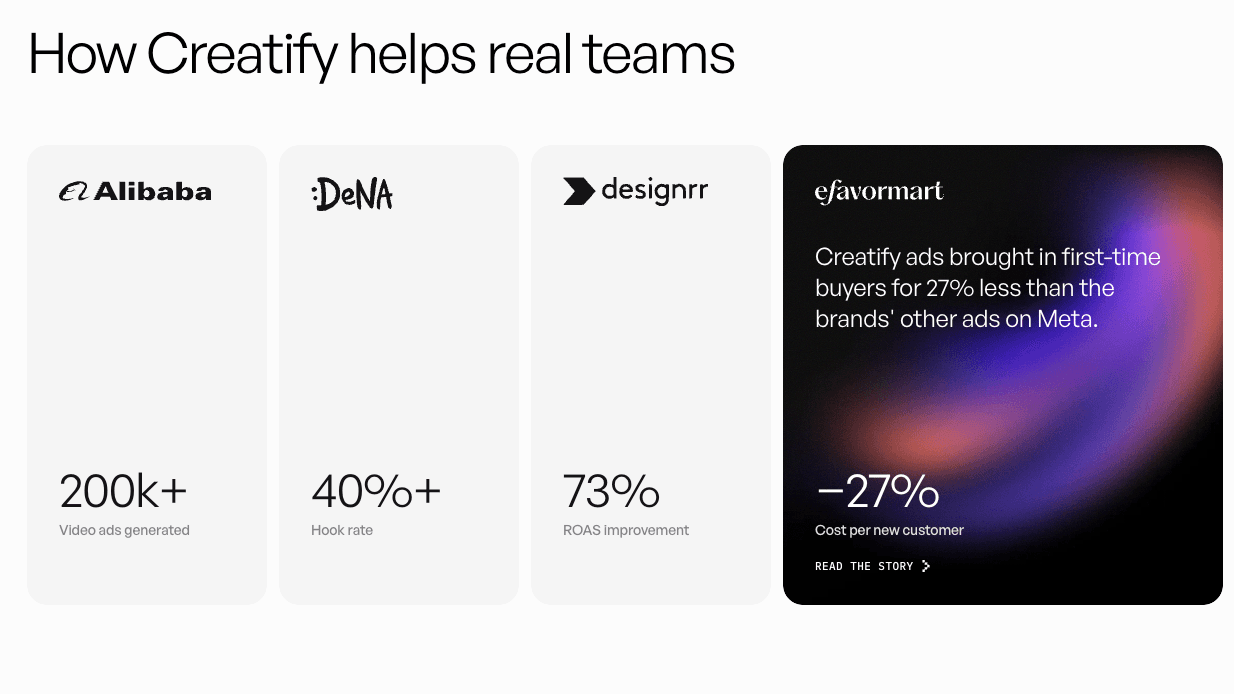
- The advertising examples suit the visual energy of the page. You can see what the product is for.
Basedash: A Consistent Visual Identity
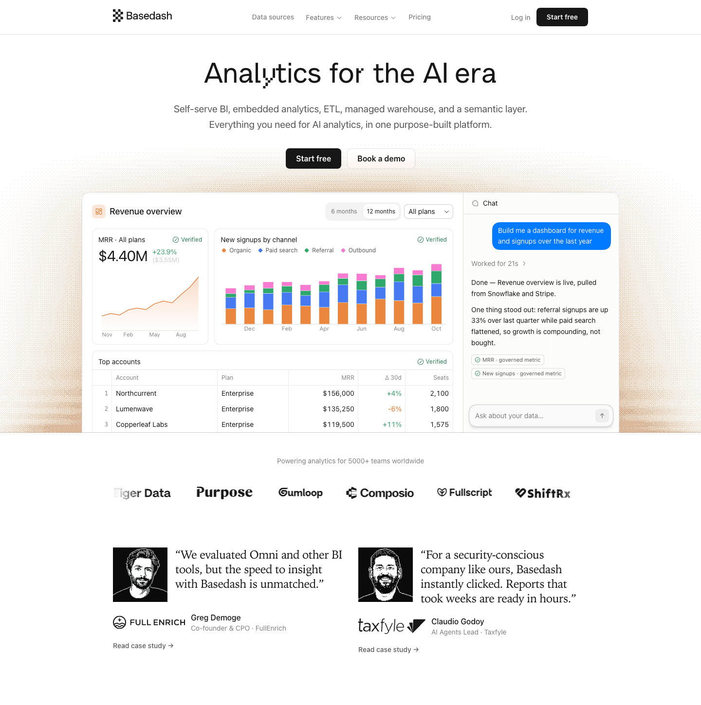
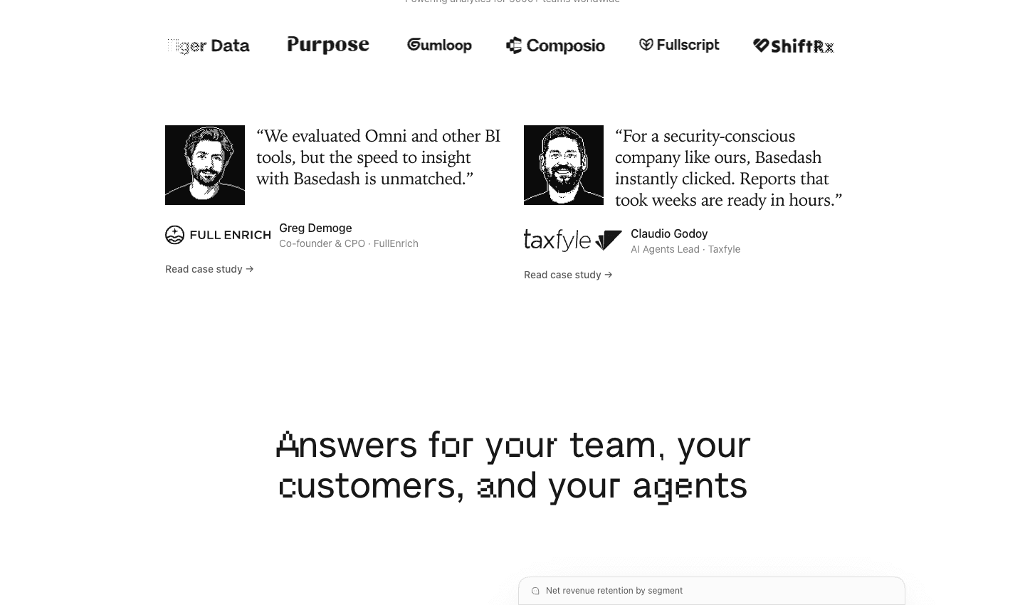
Look at the customer portraits on Basedash. They get the same monochrome, pixelated treatment as the artwork. Alongside orange accents and glitch-like heading effects, those details give the analytics product a consistent visual identity.
Why we like this page
- The pixelated treatment carries through backgrounds, illustrations, and photography, making assets from different sources feel at home together.
- Orange accents stand out against the grayscale parts of the page.
- “Start free” and “Book a demo” cover visitors who want to explore alone or talk through the product first.
How We Picked These SaaS Landing Page Examples
We looked for pages with a point of view that still communicate their product’s value. Our selection came down to five things:
- Colors that work together and make important elements easy to find.
- Typography that’s readable, with a clear difference between headings and supporting copy.
- Something distinctive enough to remember after closing the tab.
- Imagery that explains the software or gives the brand personality.
- A hierarchy that helps visitors understand the offer and decide where to go next.
Final Thoughts
Choose the example that addresses a problem on your own page. If visitors can’t picture the product, Tella’s demonstrations may help more than a new color palette. If everything competes for attention, try giving one asset the space Sublime does. Make the change, then ask someone unfamiliar with your product what it does and where they’d click next.