16 Landing Page Examples and What to Borrow From Each

Good landing page examples make the next step understandable. These 16 pages show how SaaS, B2B, consumer, and mobile brands use spacing, imagery, hierarchy, and calls to action to explain their products. Borrow the decision behind the design: what gets attention, what provides context, and what makes the next click feel natural.
SaaS landing page examples
Clear product previews help SaaS landing pages explain what software does and how it fits into everyday work.
Notion: color with restraint
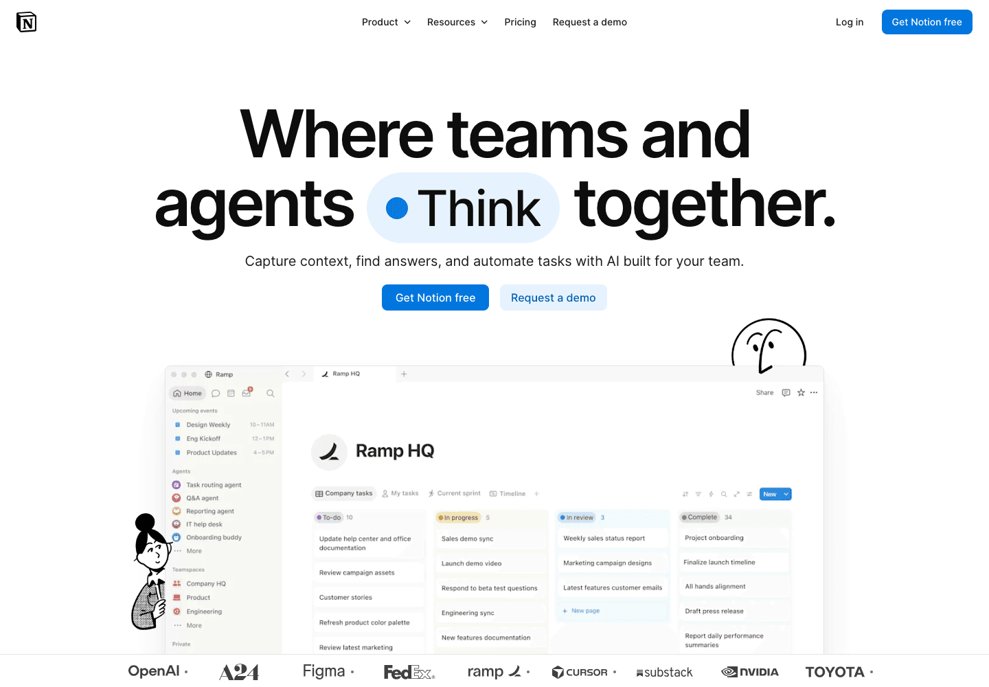
Notion combines a grayscale foundation with selective accent colors. White space separates ideas, so the page gives you time to digest one bite at a time. For a product with many uses, that restraint matters: the interface can do the explaining without every section competing for attention.
- Keep most surfaces neutral and assign accents a clear job.
- Separate product stories with space rather than more decoration.
Wise: make the page scannable
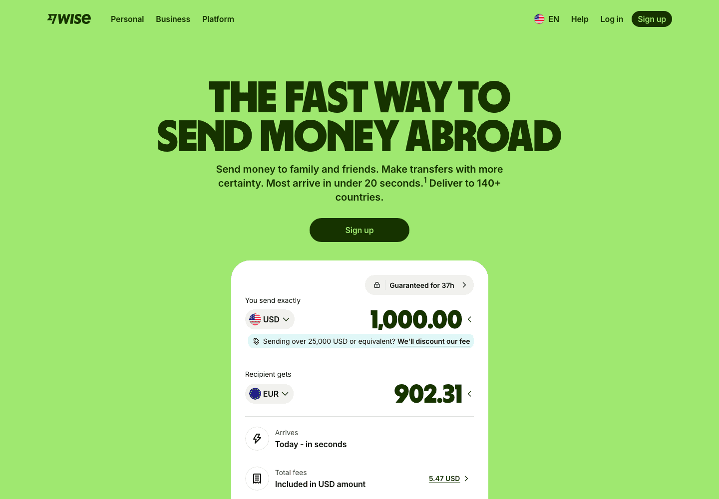
Wise pairs heavy headings with rounded shapes and a distinctive green palette. It belongs to financial services rather than conventional SaaS, but the design lesson travels well. Visuals and clear section titles carry the explanation before visitors commit to reading the supporting copy.
- Make headings useful when read on their own.
- Repeat shapes and colors so separate sections feel related.
Saily: combine graphics and photography

Saily sells travel connectivity, not an abstract software feature. Its mix of photography and graphic elements gives the service context while keeping the page approachable. The bright yellow accents add personality without requiring long paragraphs to make the offering feel distinct.
- Use photography to show the situation your product helps with.
- Keep expressive graphics consistent with the rest of the page.
Substack: put the outcome first
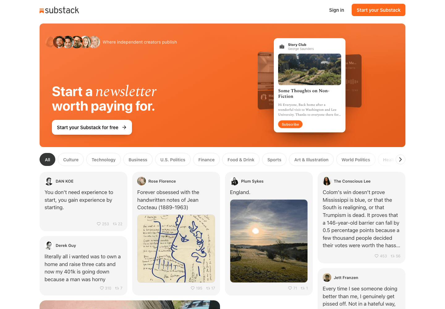
Substack leads with the possibility of earning from creative work. The product is a publishing platform, but the invitation speaks to a writer’s motivation. That’s useful for founders explaining a familiar category: the benefit can lead, while the mechanics follow further down.
- Name the result visitors want before listing features.
- Give starting and exploring different levels of emphasis.
B2B landing page examples
Product details and customer evidence give B2B landing pages the context buyers need to evaluate a service.
Attio: show the system
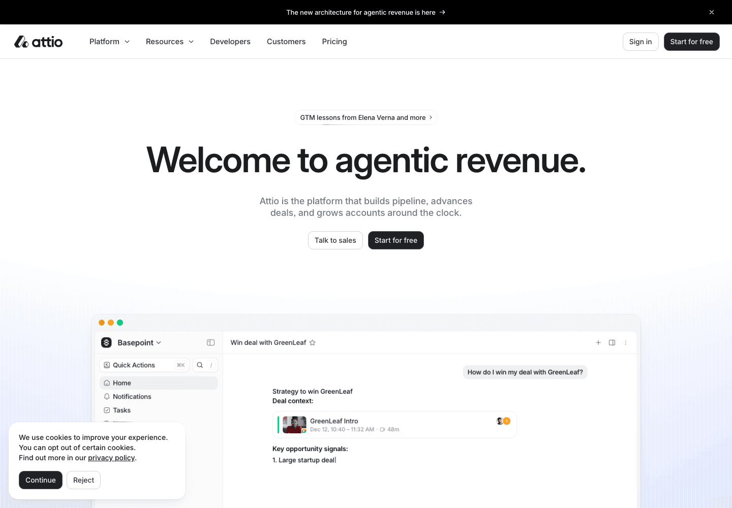
Attio has a complex CRM story to tell. Product interfaces and clearly separated capabilities make that story more concrete than a broad promise about productivity. The useful lesson is specificity: show what someone will organize, inspect, or automate after they become a customer.
- Choose interface examples that explain a recognizable task.
- Connect platform capabilities to work a buyer already understands.
Docusign: offer paths for different buyers
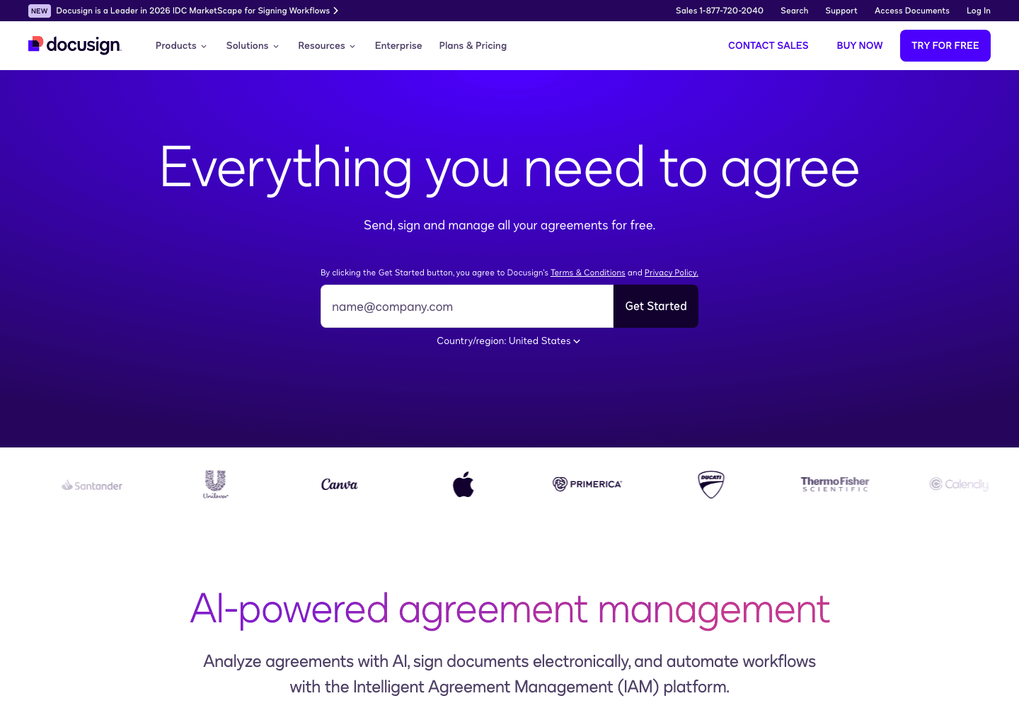
Docusign serves people who need a signature today and teams evaluating a larger agreement platform. Its page gives those visitors different routes. A B2B homepage can support both, provided the next steps explain their purpose instead of presenting a row of equally vague buttons.
- Distinguish self-service actions from conversations with sales.
- Keep product categories understandable outside your internal vocabulary.
Vanta: bring trust into the explanation
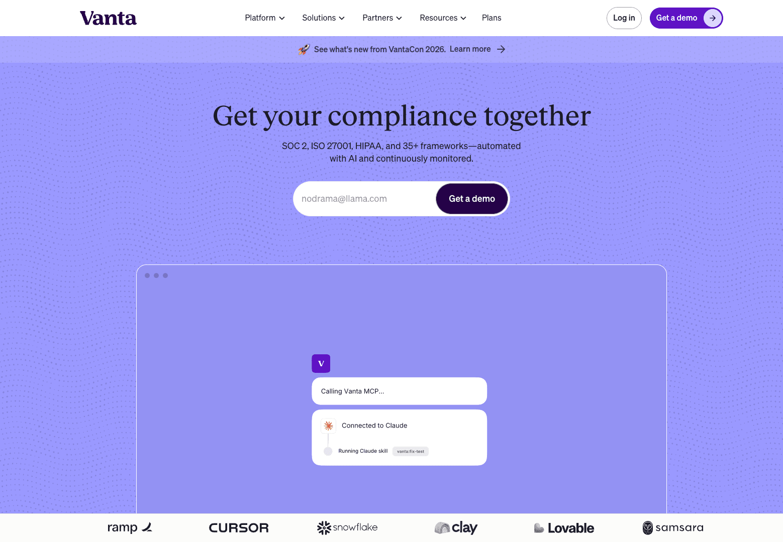
Vanta’s subject is trust and compliance, so customer evidence belongs close to the product story. Recognizable businesses and concrete customer outcomes help visitors place an unfamiliar platform. Borrow the relationship between evidence and claim, rather than adding a logo strip simply because other sites have one.
- Place relevant proof near the claim it supports.
- Explain the operational problem behind a compliance label.
Gusto: make business software approachable
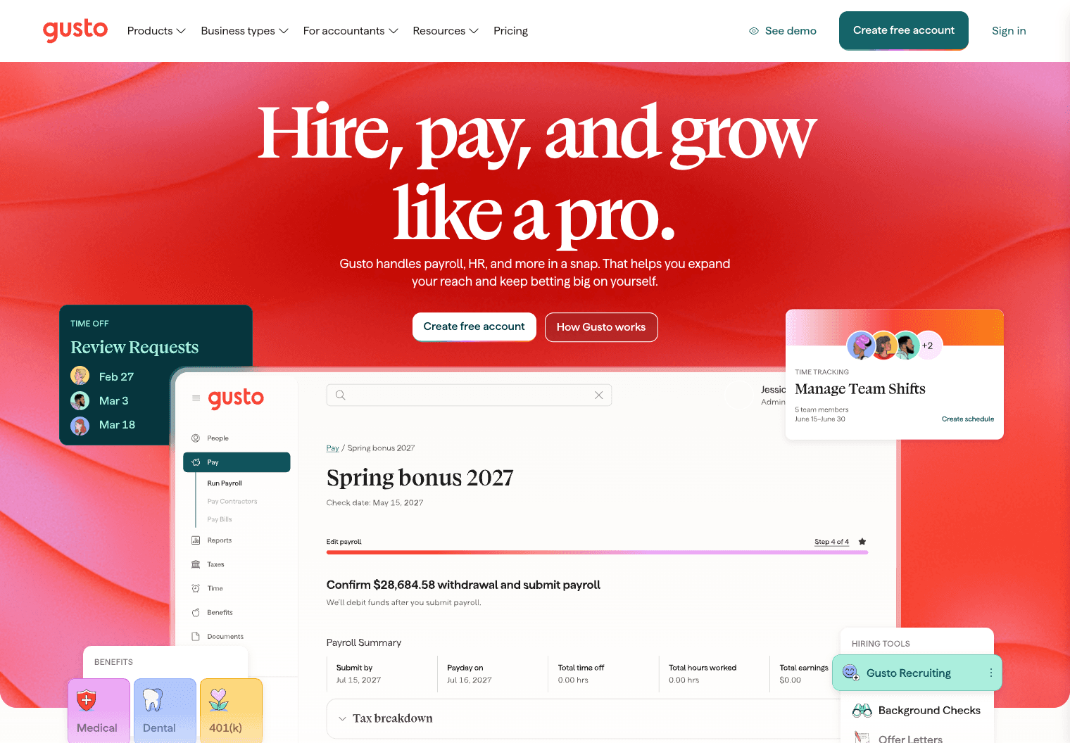
Gusto frames payroll and HR around hiring, paying, and growing a team. That language makes a broad platform easier to enter. The page also provides demo and account routes, letting someone explore with a person or take an initial step independently.
- Group features around the jobs your customer needs done.
- Use plain language even when the underlying workflow is complicated.
Consumer product landing page examples
Consumer product landing pages use photography, clear options, and short descriptions to help shoppers understand an offer and decide what to buy.
Apple: give each product room
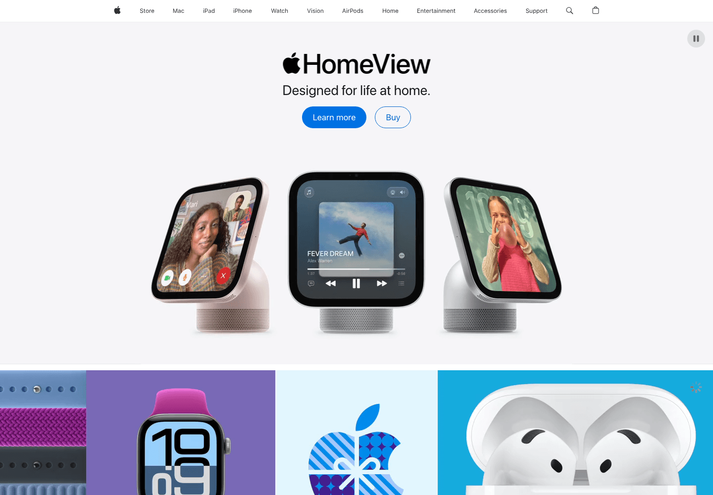
Apple’s homepage organizes a large catalog into distinct product moments. Large images and short copy give each offer its own space. This works partly because the brand and products are familiar; a new business should borrow the visual focus while adding enough explanation for a first-time visitor.
- Let one product dominate each section.
- Pair a route to learn more with a clear purchase route.
Loop Earplugs: show the buying decision
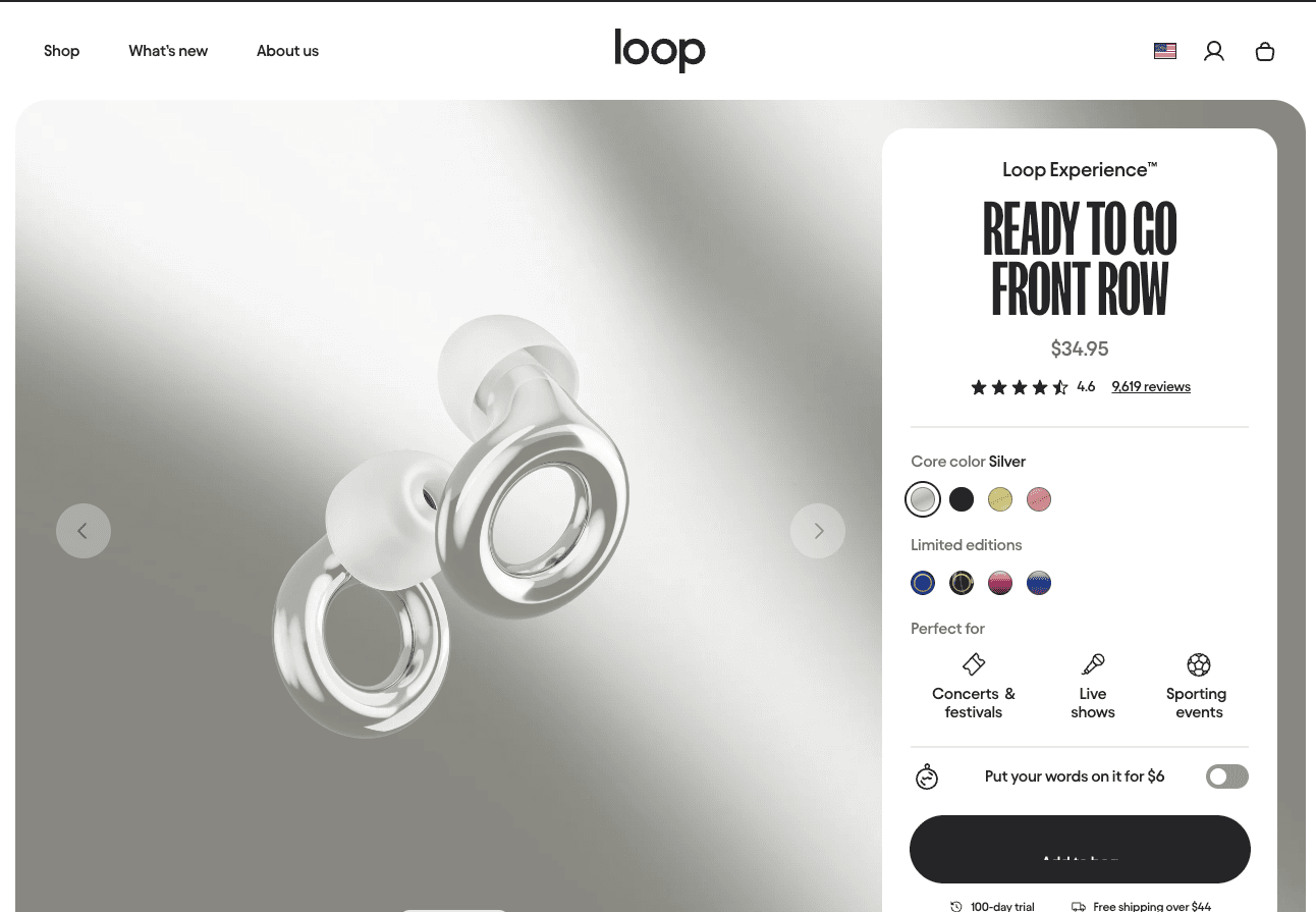
Loop’s Experience page is a product detail page, making it a useful contrast to the homepages here. Visitors need to understand the earplugs and choose an option. Product imagery, available finishes, and purchase controls belong together so browsing can turn into a concrete decision.
- Show the product closely enough to judge its form.
- Keep option selection near the action it affects.
Google Store: organize a family of devices

Google Store needs to introduce several devices without turning the page into a specification sheet. Product-led sections give visitors entry points into that catalog. For a smaller store, the lesson is to make browsing manageable before asking someone to compare every detail.
- Separate categories before presenting detailed comparisons.
- Use consistent product imagery to make the catalog easier to scan.
Hims: start with the customer’s concern
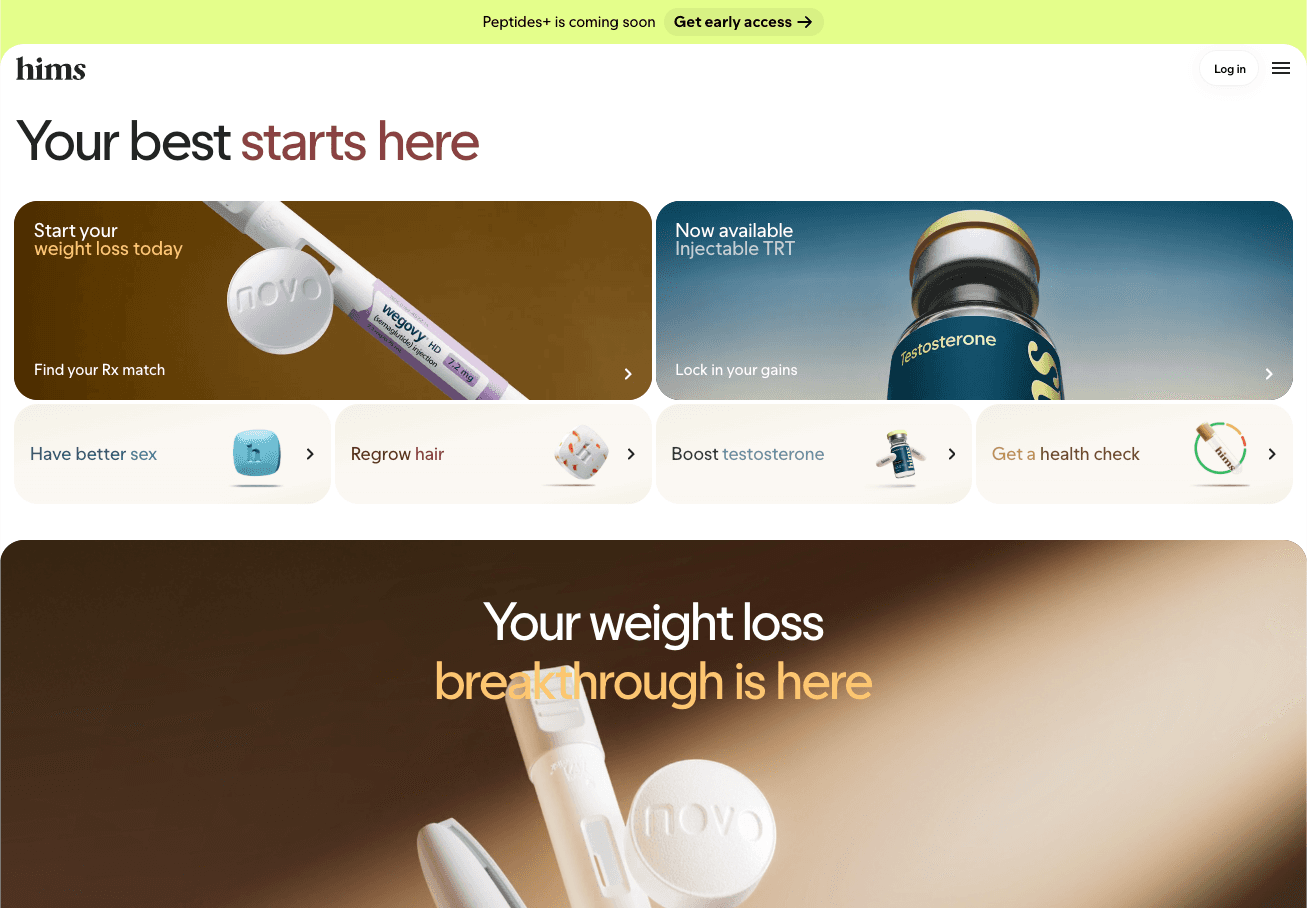
Hims is worth considering for how a consumer health brand organizes different concerns under one identity. For this category, a visually simple page still needs clear information about the service and its limits. Borrow the focus on visitor needs, while treating medical claims as a separate editorial responsibility.
- Organize entry points around what visitors came to understand.
- Keep important qualifications readable rather than hiding them in decorative copy.
Mobile app landing page examples
Mobile app landing pages connect screen previews to everyday tasks, showing what the app helps people do before they download it.
Cash App: explain the everyday job
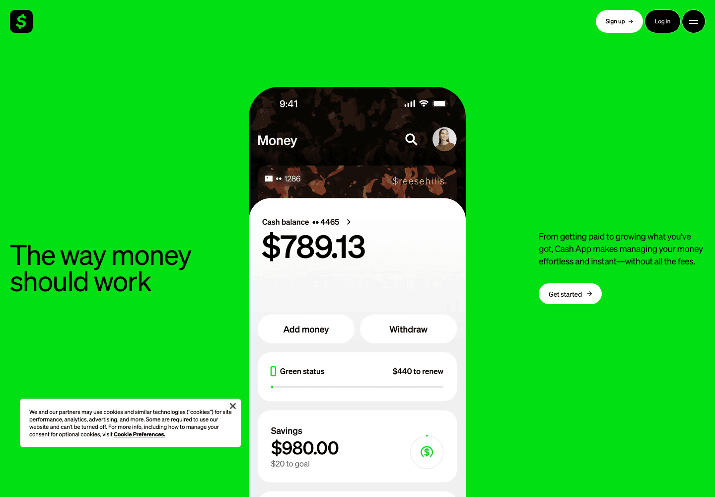
Cash App introduces money tasks people already recognize rather than opening with infrastructure. That’s a useful starting point for an app landing page: connect the download to an activity. A visitor should understand why they would open the app after installing it.
- Describe a familiar task in everyday language.
- Make the route from website to app easy to identify.
Bevel: give health data context
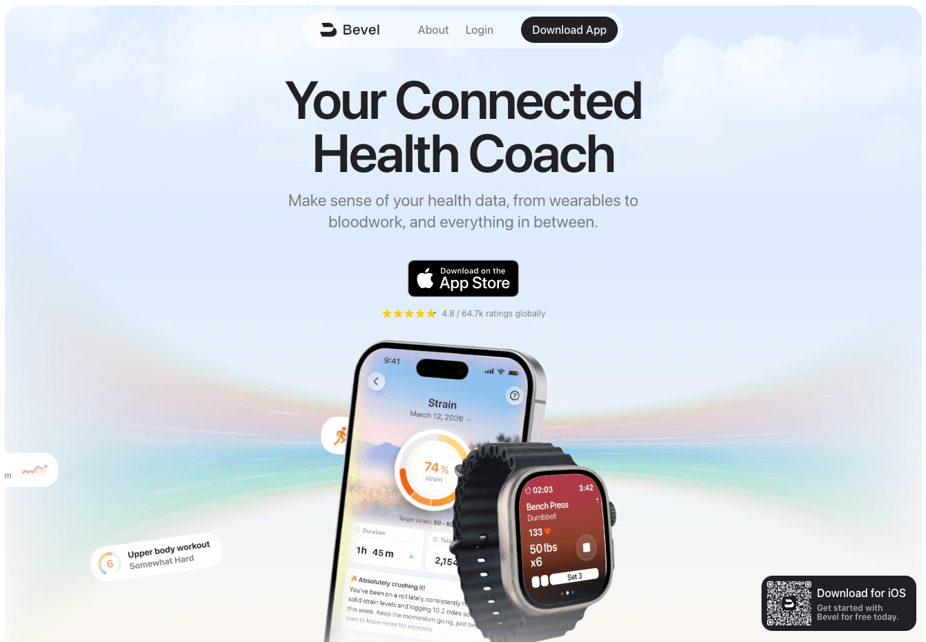
Bevel presents a connected health coach rather than a loose collection of charts. App imagery makes the experience tangible, while the surrounding explanation connects measurements to daily decisions. If your product contains dense information, show what that information helps a person do.
- Pair interface previews with the question each screen answers.
- Keep the app download accessible throughout the product explanation.
Flighty: make the use case immediate
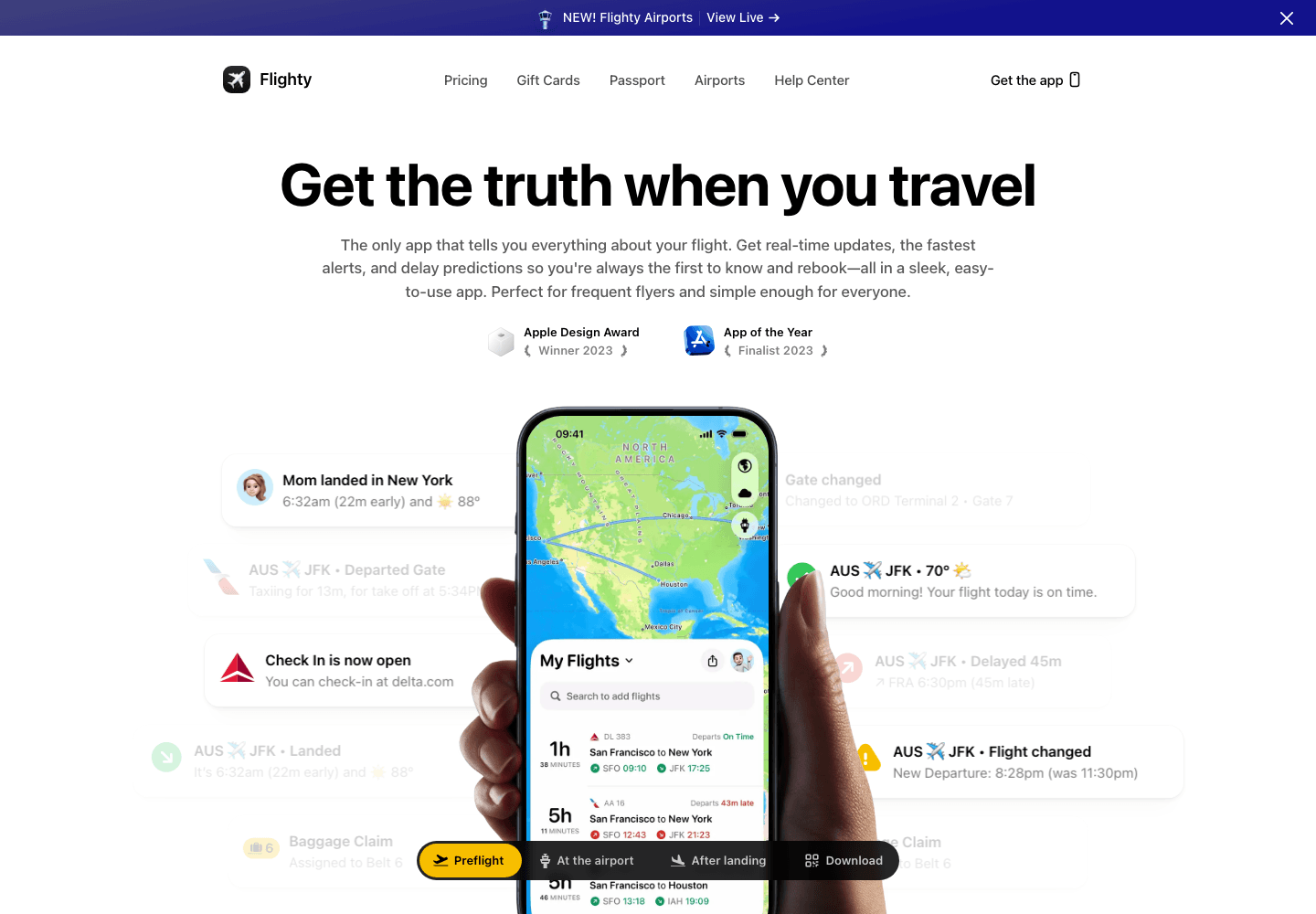
Flighty’s flight-tracking focus makes the product easy to place. Travel information and app previews have an obvious relationship, so the page can explain the experience through recognizable situations. A narrow use case often gives a mobile landing page a stronger starting point than a broad lifestyle promise.
- Show the moment when the app becomes useful.
- Use interface details that a potential user can recognize quickly.
ReciMe: demonstrate the workflow
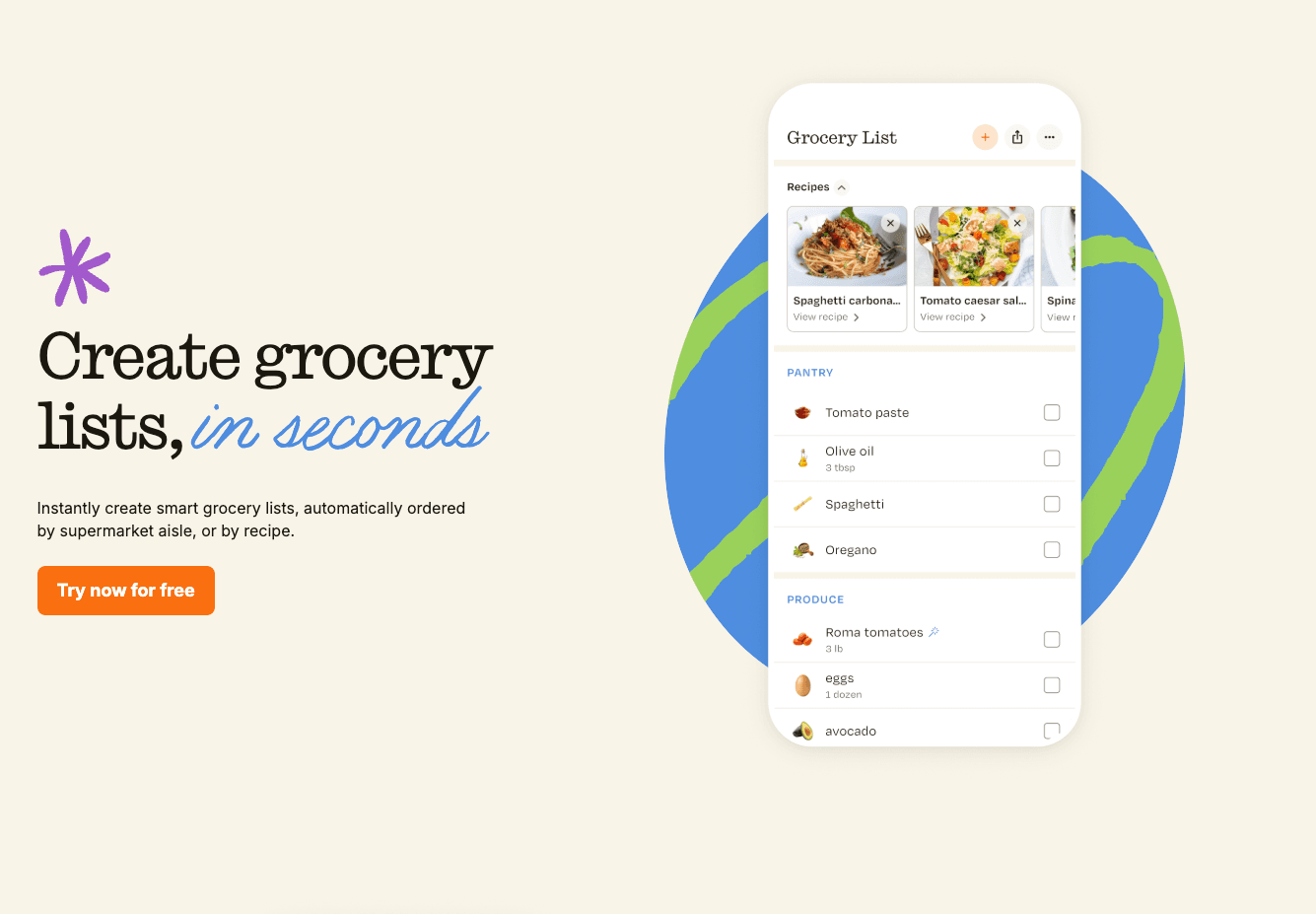
ReciMe connects recipe collecting, planning, and cooking into a practical story. That sequence gives app screenshots a purpose beyond showing attractive screens. For a utility app, explaining how someone moves through a task can be more persuasive than presenting isolated features with equal weight.
- Arrange capabilities in the order someone would use them.
- Make the download feel like the next step in that workflow.
Final thoughts
Pick one lesson to apply: simplify a heading, replace a decorative image with a useful preview, or make the primary action clearer. Then check the page on a phone. Product previews and clear hierarchy are recurring patterns in SaaS landing pages.