Browse components
Cards
Flexible content, product, and dashboard card layouts for common interface patterns.
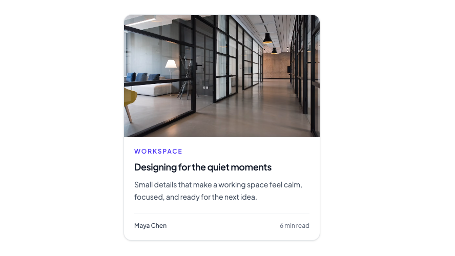
Editorial card with a full-bleed image, story metadata, and optional link wrapper.
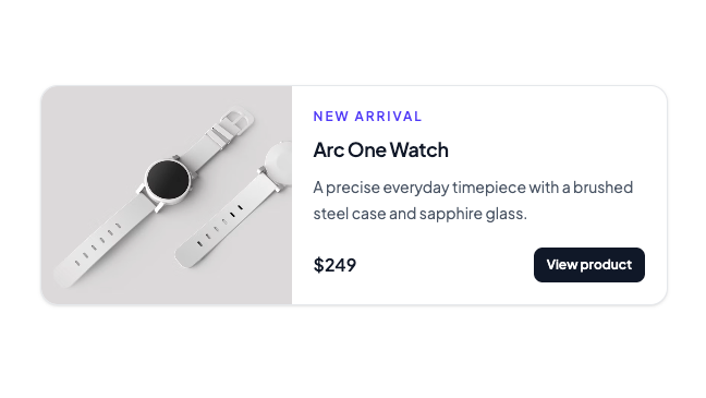
Side-by-side card with image, title, description, and a clear action.
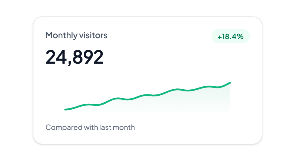
Compact dashboard metric with a trend badge and inline sparkline.
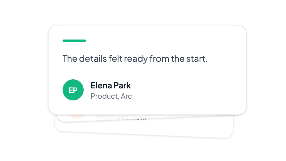
Layered testimonial cards that cycle forward with a spring stack. Click the front card to advance.
About Cards Components
Cards help group related information into clear, reusable interface units. This collection covers layouts for product details, dashboards, and marketing content.
Each example is built with React and Tailwind CSS so you can copy the structure, replace the content, and tune the visual hierarchy for your product.
Frequently asked questions
What are card components used for?
Cards group related content and actions into a scannable unit. They work well for product summaries, dashboards, pricing, testimonials, and content previews.
Can I customize these card components?
Yes. Copy the source into your project, then change the Tailwind classes, content, spacing, and props to match your product and brand.
Do card components work on mobile?
Yes. The examples use responsive Tailwind utilities, but you should still check card density and action placement at your target breakpoints.