Browse components
Backgrounds
Hero backgrounds, gradients, and surface patterns for section shells.
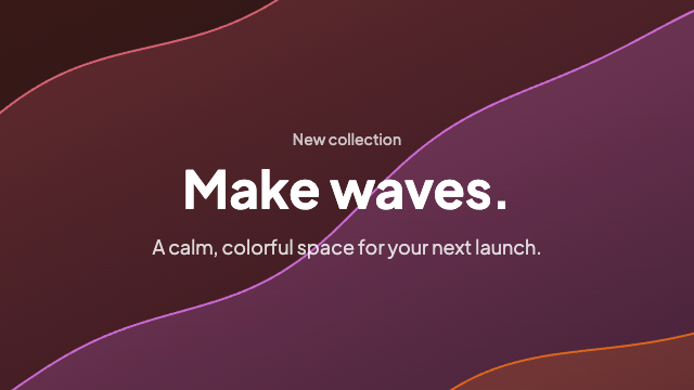
Animated canvas waves that fill the container and drift with the pointer — a softer, SaaS-ready take on classic wavy backgrounds.
Subtle canvas meteors drifting across a dark sky — a quiet animated background for heroes and landing sections.
Staggered neon trails that sweep across a dark field — colors are prop-driven for easy theming.
Soft layered waves in parallax drift — cool indigo tones by default, colors via props.
Northern lights as folding canvas curtains: irregular ribbons and faint rays drifting across a night sky.
A static 3D background grid — a wireframe perspective grid that covers the full container, warped and bowed toward a vanishing point for depth. No animation, no layout shift.
About Backgrounds Components
Background components give landing-page sections depth without competing with the content placed above them. The collection includes patterns, gradients, and animated effects for hero and section shells.
Use these as a starting point, then adjust color, motion, and contrast so text remains readable and the effect supports the page instead of becoming the page.
Frequently asked questions
Where should I use background components?
Use them behind hero sections, feature areas, or page shells when a plain surface needs more visual depth without changing the content structure.
Can I change the colors and animation?
Yes. Most examples expose color and motion options or use straightforward Tailwind and CSS values that you can replace after copying the source.
How do I keep backgrounds accessible?
Maintain strong text contrast, avoid distracting motion, and respect reduced-motion preferences whenever you adapt an animated background.