Browse components
Horizontal Card
Side-by-side card with image, title, description, and a clear action.
Add to your project
Pick the way you like to build.
Let your AI assistant add it
Copy this prompt and paste it into the AI tool building your site.
# Integrate this UI component

Add this component to my project.

1. Install any missing dependencies.
2. Make sure Tailwind CSS is set up and scans the new file.
3. Prefer passing props over editing the component source — changing the component itself may break it.
4. Adjust colors, size, and layout via props or wrapper classes to match my project. You know my codebase better than this snippet does.

## Component source

```tsx
type HorizontalCardProps = {
  image?: string;
  imageAlt?: string;
  label?: string;
  title?: string;
  description?: string;
  price?: string;
  actionLabel?: string;
  href?: string;
  className?: string;
};

export default function HorizontalCard({
  image = 'https://assets.uniquel.io/components/stock/photo-1523275335684-37898b6baf30.jpg',
  imageAlt = 'Minimal black watch',
  label = 'New arrival',
  title = 'Arc One Watch',
  description = 'A precise everyday timepiece with a brushed steel case and sapphire glass.',
  price = '$249',
  actionLabel = 'View product',
  href = '#',
  className = '',
}: HorizontalCardProps) {
  return (
    <article
      className={[
        'flex max-w-xl overflow-hidden rounded-2xl border border-gray-200 bg-white shadow-sm',
        className,
      ]
        .filter(Boolean)
        .join(' ')}
    >
      <img src={image} alt={imageAlt} className='w-2/5 object-cover' />
      <div className='flex min-w-0 flex-1 flex-col p-5'>
        <p className='text-xs font-semibold uppercase tracking-[0.16em] text-indigo-600'>{label}</p>
        <h3 className='mt-2 text-lg font-semibold tracking-tight text-gray-900'>{title}</h3>
        <p className='mt-2 text-sm leading-6 text-gray-600'>{description}</p>
        <div className='mt-auto flex items-center justify-between gap-3 pt-5'>
          <span className='text-base font-semibold text-gray-900'>{price}</span>
          <a
            href={href}
            className='rounded-lg bg-gray-900 px-3 py-2 text-xs font-semibold text-white transition-colors hover:bg-gray-700 focus:outline-none focus-visible:ring-2 focus-visible:ring-gray-900 focus-visible:ring-offset-2'
          >
            {actionLabel}
          </a>
        </div>
      </div>
    </article>
  );
}

```
Works with your AI tools
 Claude*
 Codex*
 Lovable
 Base44
 Figma Make
 Replit*
 Cursor*
 v0
v0* Compatible with most projects that use the default React/Next.js framework.
Built With
 React
React Tailwind CSS
Props
| Prop | Type | Description |
|---|---|---|
image | string | Product image URL |
imageAlt | string | Product image alt text |
label | string | Small category label |
title | string | Product name |
description | string | Product description |
price | string | Price label |
actionLabel | string | Action button text |
href | string | Action URL |
className | string | Styles for the outer card |
More Cards Components
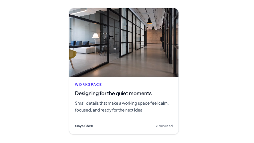
Editorial card with a full-bleed image, story metadata, and optional link wrapper.
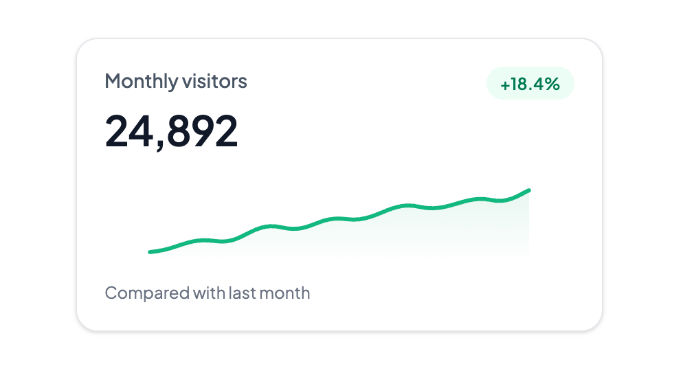
Compact dashboard metric with a trend badge and inline sparkline.
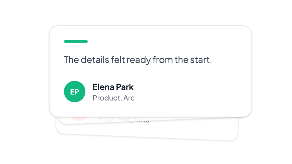
Layered testimonial cards that cycle forward with a spring stack. Click the front card to advance.