Browse components
React Number Input
Labeled React number input with an optional unit, stacked controls, bounds, and empty values.
Add to your project
1Connect the Uniquel MCP
Connect Uniquel to your coding agent before using the component ID.
Connect MCP2Copy the component ID
MCP ID
component:input/react-number-inputWorks with your AI tools
 Claude*
 Codex*
 Lovable
 Base44
 Figma Make
 Replit*
 Cursor*
 v0
* Compatible with most projects that use the default React/Next.js framework.
Built With
 React
 Tailwind CSSSolar Icons
Props
| Prop | Type | Description |
|---|---|---|
label* | string | Visible field label. |
value | number | null | Controlled value. |
defaultValue | number | null | Initial uncontrolled value. |
onValueChange | (value: number | null) => void | Called with a finite number or null. |
min | number | Lowest allowed value. |
max | number | Highest allowed value. |
step | number | Keyboard and button step size. |
unit | string | Optional unit displayed inside the field. |
hint | string | Supporting field guidance. |
error | string | Validation message and error state. |
disabled | boolean | Disables the field and controls. |
More Input Components
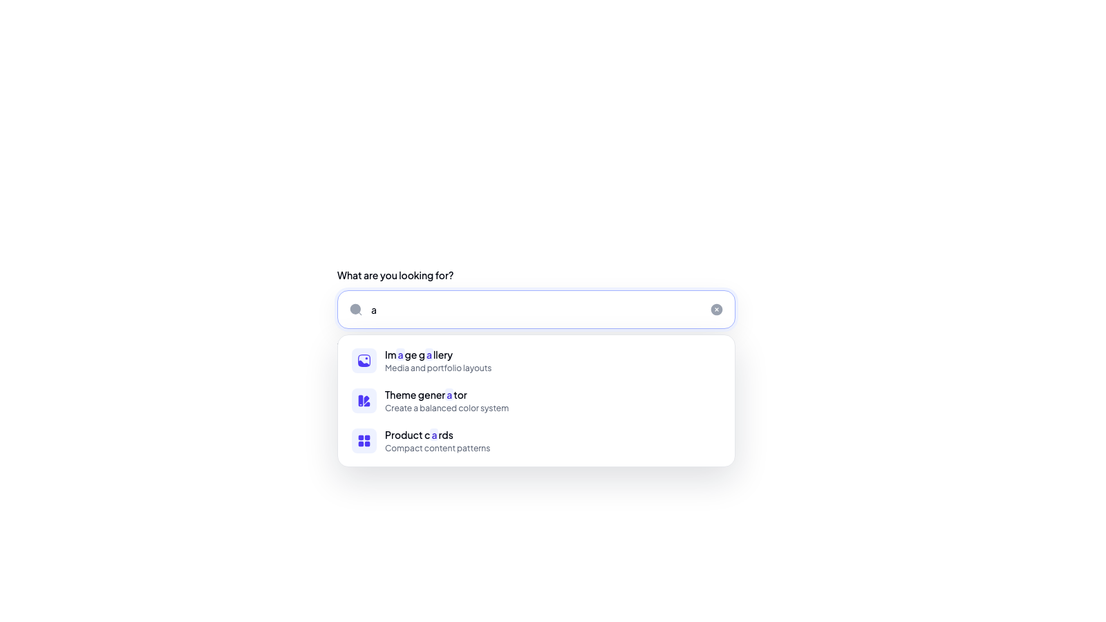
Accessible React search bar with highlighted results, keyboard navigation, and polished loading and empty states.
A six-digit PIN input with paste support and keyboard navigation for verification codes.
15000
A vertical range input with configurable value labels, thumb shapes, colors, and height.
A premium search input with a focused state and an icon that becomes a submit action as you type.
A minimalist input spinner for choosing quantities with buttons, typing, or arrow keys.